
Loading…
Loading…
Creator · Aceternity UI
The reproduction prompt keeps the original and adds runtime, asset and acceptance requirements. These additions are not the author’s words.
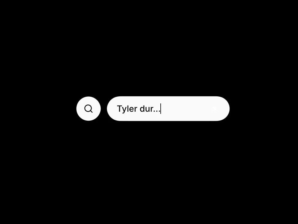
// components/ui/gooey-input.tsx
"use client";

import {
  useState,
  useRef,
  useEffect,
  useId,
  useMemo,
  useCallback,
  type ChangeEvent,
} from "react";
import { motion } from "motion/react";
import { cn } from "@/lib/utils";

function GooeyFilter({
  filterId,
  blur,
}: {
  filterId: string;
  blur: number;
}) {
  return (
    <svg className="absolute hidden h-0 w-0" aria-hidden>
      <defs>
        <filter id={filterId} x="-50%" y="-50%" width="200%" height="200%">
          <feGaussianBlur in="SourceGraphic" stdDeviation={blur} result="blur" />
          <feColorMatrix
            in="blur"
            type="matrix"
            values="1 0 0 0 0  0 1 0 0 0  0 0 1 0 0  0 0 0 20 -10"
            result="goo"
          />
          <feComposite in="SourceGraphic" in2="goo" operator="atop" />
        </filter>
      </defs>
    </svg>
  );
}

function SearchIcon({ layoutId }: { layoutId: string }) {
  return (
    <motion.svg
      layoutId={layoutId}
      xmlns="http://www.w3.org/2000/svg"
      viewBox="0 0 24 24"
      fill="none"
      stroke="currentColor"
      strokeLinecap="round"
      strokeLinejoin="round"
      strokeWidth={2}
      className="size-4 shrink-0"
    >
      <circle cx="11" cy="11" r="8" />
      <path d="m21 21-4.3-4.3" />
    </motion.svg>
  );
}

const transition = {
  duration: 0.4,
  type: "spring" as const,
  bounce: 0.25,
};

const iconBubbleVariants = {
  collapsed: { scale: 0, opacity: 0 },
  expanded: { scale: 1, opacity: 1 },
};

export interface GooeyInputClassNames {
  root?: string;
  filterWrap?: string;
  buttonRow?: string;
  trigger?: string;
  input?: string;
  bubble?: string;
  bubbleSurface?: string;
}

export interface GooeyInputProps {
  placeholder?: string;
  className?: string;
  classNames?: GooeyInputClassNames;
  /** Collapsed control width in px */
  collapsedWidth?: number;
  /** Expanded control width in px */
  expandedWidth?: number;
  /** Horizontal offset when expanded (px), aligns detached bubble */
  expandedOffset?: number;
  /** Gaussian blur amount for the gooey SVG filter */
  gooeyBlur?: number;
  value?: string;
  defaultValue?: string;
  onValueChange?: (value: string) => void;
  onOpenChange?: (open: boolean) => void;
  disabled?: boolean;
}

export function GooeyInput({
  placeholder = "Type to search...",
  className,
  classNames,
  collapsedWidth = 115,
  expandedWidth = 200,
  expandedOffset = 50,
  gooeyBlur = 5,
  value: valueProp,
  defaultValue = "",
  onValueChange,
  onOpenChange,
  disabled = false,
}: GooeyInputProps) {
  const reactId = useId();
  const safeId = reactId.replace(/:/g, "");
  const filterId = `gooey-filter-${safeId}`;
  const iconLayoutId = `gooey-input-icon-${safeId}`;
  const inputLayoutId = `gooey-input-field-${safeId}`;

  const inputRef = useRef<HTMLInputElement>(null);
  const prevExpandedRef = useRef(false);
  const [isExpanded, setIsExpanded] = useState(false);
  const [uncontrolledValue, setUncontrolledValue] = useState(defaultValue);

  const isControlled = valueProp !== undefined;
  const searchText = isControlled ? valueProp : uncontrolledValue;

  const setSearchText = useCallback(
    (next: string) => {
      if (!isControlled) {
        setUncontrolledValue(next);
      }
      onValueChange?.(next);
    },
    [isControlled, onValueChange],
  );

  const setExpanded = useCallback(
    (next: boolean) => {
      setIsExpanded(next);
      onOpenChange?.(next);
    },
    [onOpenChange],
  );

  useEffect(() => {
    if (isExpanded) {
      inputRef.current?.focus();
    } else if (prevExpandedRef.current) {
      setSearchText("");
    }
    prevExpandedRef.current = isExpanded;
  }, [isExpanded, setSearchText]);

  const buttonVariants = useMemo(
    () => ({
      collapsed: { width: collapsedWidth, marginLeft: 0 },
      expanded: { width: expandedWidth, marginLeft: expandedOffset },
    }),
    [collapsedWidth, expandedWidth, expandedOffset],
  );

  const handleExpand = useCallback(() => {
    if (!disabled) setExpanded(true);
  }, [disabled, setExpanded]);

  const handleChange = useCallback(
    (e: ChangeEvent<HTMLInputElement>) => {
      setSearchText(e.target.value);
    },
    [setSearchText],
  );

  const handleBlur = useCallback(() => {
    if (!searchText) setExpanded(false);
  }, [searchText, setExpanded]);

  const surfaceClass =
    "bg-foreground text-background shadow-sm ring-1 ring-border/60";

  return (
    <div
      className={cn(
        "relative flex items-center justify-center",
        className,
        classNames?.root,
      )}
    >
      <GooeyFilter filterId={filterId} blur={gooeyBlur} />

      <div
        className={cn(
          "relative flex h-10 items-center justify-center",
          classNames?.filterWrap,
        )}
        style={{ filter: `url(#${filterId})` }}
      >
        <motion.div
          className={cn("flex h-10 items-center justify-center", classNames?.buttonRow)}
          variants={buttonVariants}
          initial="collapsed"
          animate={isExpanded ? "expanded" : "collapsed"}
          transition={transition}
        >
          <button
            type="button"
            disabled={disabled}
            onClick={handleExpand}
            className={cn(
              "flex h-10 w-full cursor-pointer items-center justify-center gap-2 rounded-full px-4 text-sm font-medium outline-none transition-[color,box-shadow] focus-visible:ring-2 focus-visible:ring-ring focus-visible:ring-offset-2 focus-visible:ring-offset-background disabled:pointer-events-none disabled:opacity-50",
              surfaceClass,
              classNames?.trigger,
            )}
          >
            {!isExpanded ? (
              <SearchIcon layoutId={iconLayoutId} />
            ) : null}
            <motion.input
              layoutId={inputLayoutId}
              ref={inputRef}
              type="search"
              enterKeyHint="search"
              autoComplete="off"
              value={searchText}
              onChange={handleChange}
              onBlur={handleBlur}
              disabled={disabled || !isExpanded}
              placeholder={placeholder}
              className={cn(
                "h-full min-w-0 flex-1 bg-transparent text-sm text-background outline-none",
                isExpanded
                  ? "placeholder:text-background/50 dark:placeholder:text-background/45"
                  : "pointer-events-none placeholder:text-background/80 dark:placeholder:text-background/70",
                classNames?.input,
              )}
            />
          </button>
        </motion.div>

        <motion.div
          className={cn(
            "absolute top-1/2 left-0 flex size-10 -translate-y-1/2 items-center justify-center",
            classNames?.bubble,
          )}
          variants={iconBubbleVariants}
          initial="collapsed"
          animate={isExpanded ? "expanded" : "collapsed"}
          transition={transition}
        >
          <div
            className={cn(
              "flex size-10 items-center justify-center rounded-full",
              surfaceClass,
              classNames?.bubbleSurface,
            )}
          >
            <SearchIcon layoutId={iconLayoutId} />
          </div>
        </motion.div>
      </div>
    </div>
  );
}Models & stability
Recommended models
Independent reproductions
 Open reproduction ↗
GLM-5.3 单次生成;Codex 人工修复运行依赖、必要源码及移动布局,未重新生成。桌面/手机真实渲染和资源检查通过;完整功能与视觉还原尚未全部验收。源码、截图和修复记录见复现出处。
Reproduction source ↗Keep exploring

Copy this TSX component source into an AI coding tool such as Cursor, v0, or Claude, and tell it this is the Aceternity UI 3D Animated Pin component. It can then wire it into your React project, and you can swap the copy, colors, and trigger parameters to reuse it.
Prompt
// components/ui/3d-pin.tsx "use client"; import React, { useState } from "react"; import { motion } from "motion/react"; import { cn } from "@/lib/utils"; export const PinContainer = ({ children, title, href, className, containerClassName…
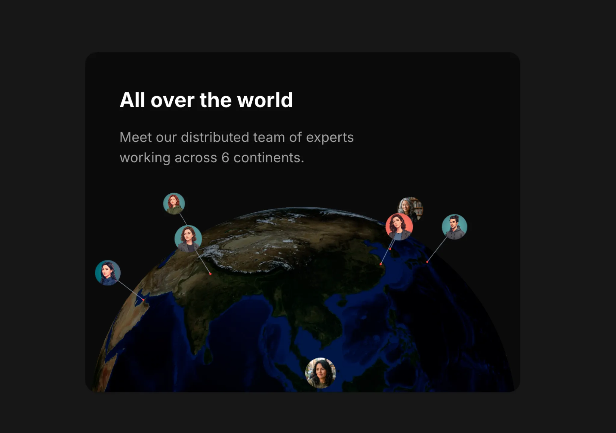
Copy this TSX component source into an AI coding tool such as Cursor, v0, or Claude, and tell it this is the Aceternity UI 3D Globe component. It can then wire it into your React project, and you can swap the copy, colors, and trigger parameters to reuse it.
Prompt
// components/ui/3d-globe.tsx "use client"; import React, { useRef, useMemo, useState, useCallback, Suspense } from "react"; import { Canvas, useFrame, useThree } from "@react-three/fiber"; import { OrbitControls, Html, useTexture } from "…
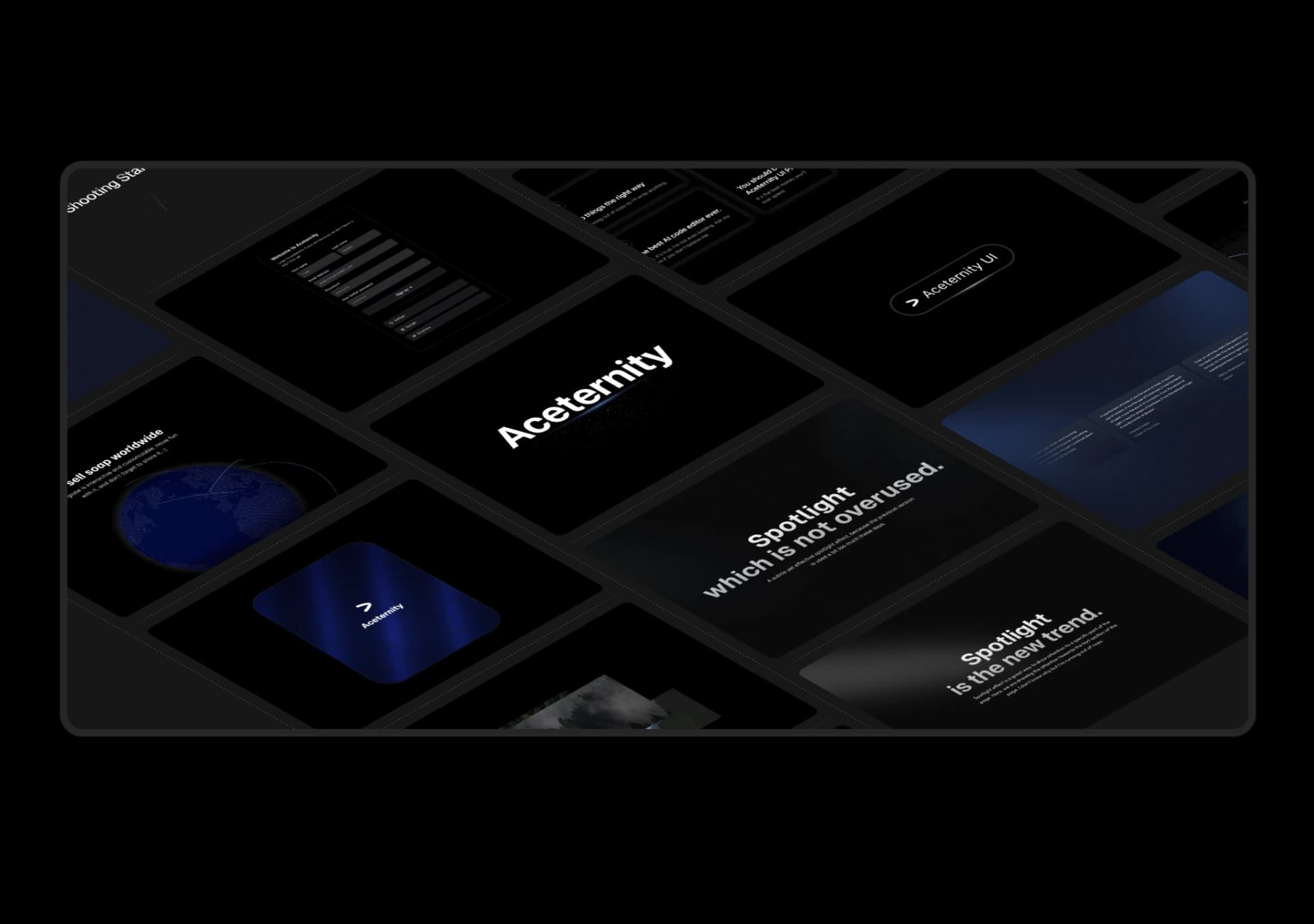
Copy this TSX component source into an AI coding tool such as Cursor, v0, or Claude, and tell it this is the Aceternity UI 3D Marquee component. It can then wire it into your React project, and you can swap the copy, colors, and trigger parameters to reuse it.
Prompt
// components/ui/3d-marquee.tsx "use client"; import { motion } from "motion/react"; import { cn } from "@/lib/utils"; export const ThreeDMarquee = ({ images, className, }: { images: string[]; className?: string; }) => { // Split the image…
Same creator
Each detail page keeps the original result, the prompt, and retest evidence in one reading path.