
Loading…
Loading…
Creator · Aceternity UI
The reproduction prompt keeps the original and adds runtime, asset and acceptance requirements. These additions are not the author’s words.
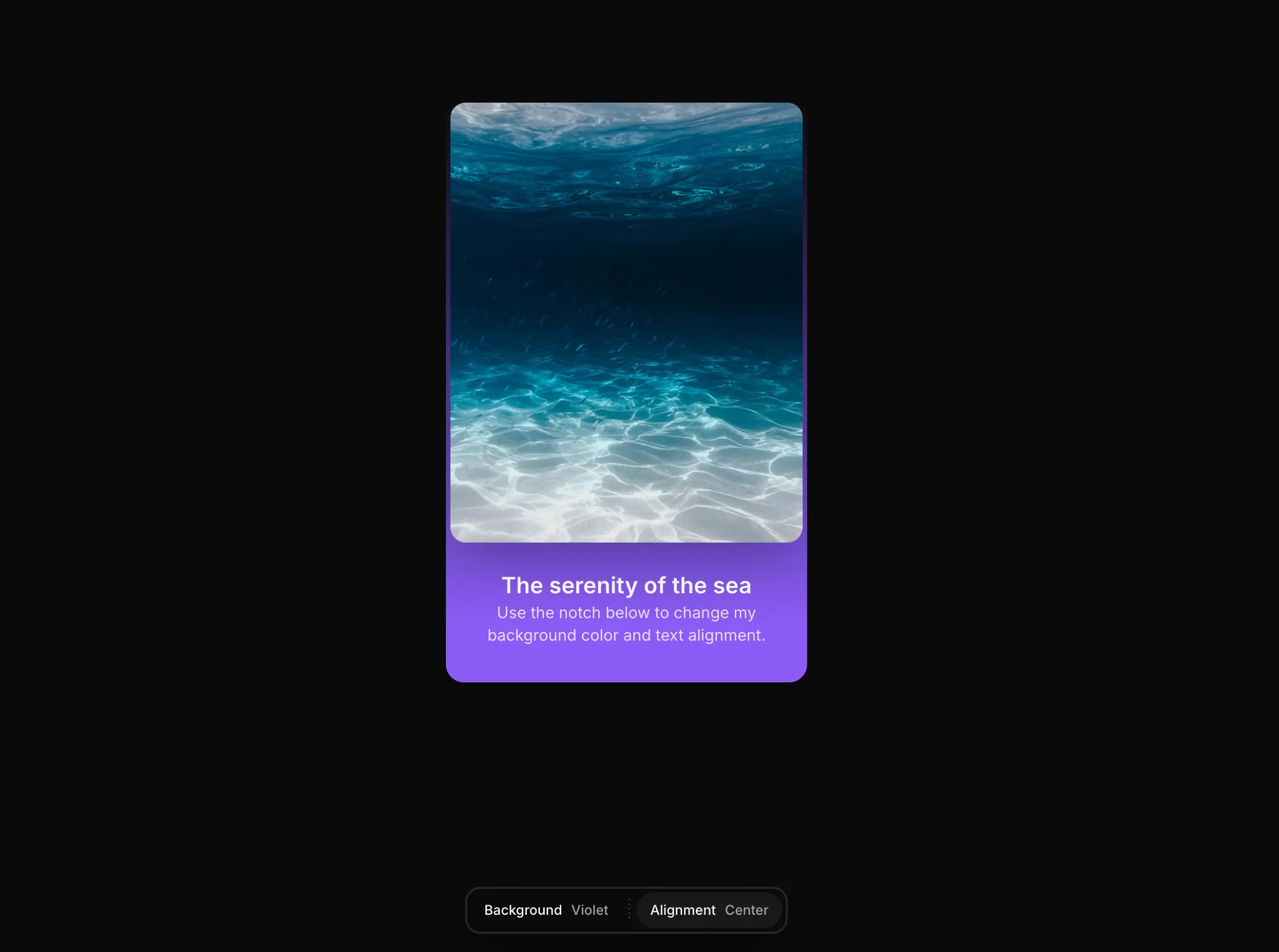
// components/ui/notch.tsx
"use client";

import React, { useEffect, useId, useRef, useState } from "react";
import { AnimatePresence, motion } from "motion/react";
import { cn } from "@/lib/utils";

export type NotchOption = {
  /** Stable identifier passed back in callbacks. */
  id: string;
  /** What renders for this option. Can be text or any node. */
  label: React.ReactNode;
  /** Optional leading node (icon, swatch, etc.) shown before the label. */
  icon?: React.ReactNode;
};

export type NotchItem = {
  /** Stable identifier for the group. */
  id: string;
  /** Trigger label shown in the bar. */
  label: React.ReactNode;
  /** Optional leading icon for the trigger. */
  icon?: React.ReactNode;
  /** The choices revealed when the group is opened. */
  options: NotchOption[];
  /** Uncontrolled initial selected option id. */
  defaultValue?: string;
  /** Controlled selected option id. */
  value?: string;
  /** Show the selected value next to the trigger label. Overrides `showSelectedValue`. */
  showValue?: boolean;
  /** Fires with the selected option whenever it changes. */
  onChange?: (optionId: string, option: NotchOption) => void;
};

export interface NotchProps {
  /** The groups shown inside the notch. Pass one or many. */
  items: NotchItem[];
  /** Pin the notch to the top or bottom of the viewport. */
  position?: "top" | "bottom";
  /** Horizontal alignment of the floating notch. */
  align?: "start" | "center" | "end";
  /** Fired for any group change, in addition to the per-item callback. */
  onItemChange?: (
    itemId: string,
    optionId: string,
    option: NotchOption,
  ) => void;
  /** Close the panel after selecting an option. */
  closeOnSelect?: boolean;
  /** Show each group's selected value next to its trigger label. */
  showSelectedValue?: boolean;
  /** Render dotted dividers between groups. */
  showDividers?: boolean;
  /** Highlight color for the selected option. Any CSS color or variable. */
  accentColor?: string;
  /** Distance from the pinned edge, in pixels. */
  offset?: number;
  /** Play the entrance animation on mount. */
  reveal?: boolean;
  /** Classes applied to the floating shell. */
  className?: string;
  /** Classes applied to every trigger. */
  itemClassName?: string;
  /** Classes applied to the options panel. */
  panelClassName?: string;
}

const SHELL_SPRING = { type: "spring" as const, stiffness: 380, damping: 34 };

const LIST_VARIANTS = {
  hidden: {},
  visible: { transition: { staggerChildren: 0.045, delayChildren: 0.08 } },
};

const OPTION_VARIANTS = {
  hidden: { opacity: 0, y: -10, filter: "blur(4px)" },
  visible: {
    opacity: 1,
    y: 0,
    filter: "blur(0px)",
    transition: { type: "spring" as const, stiffness: 420, damping: 30 },
  },
};

function NotchDivider() {
  return (
    <span
      aria-hidden
      className="mx-0.5 h-5 w-px shrink-0 self-center"
      style={{
        backgroundImage:
          "repeating-linear-gradient(180deg, rgba(255,255,255,0.35) 0px, rgba(255,255,255,0.35) 1px, transparent 1px, transparent 5px)",
        backgroundSize: "1px 4px",
        backgroundRepeat: "repeat-y",
      }}
    />
  );
}

export const Notch = ({
  items,
  position = "bottom",
  align = "center",
  onItemChange,
  closeOnSelect = true,
  showSelectedValue = true,
  showDividers = true,
  accentColor = "var(--color-blue-500, #3b82f6)",
  offset = 16,
  reveal = true,
  className,
  itemClassName,
  panelClassName,
}: NotchProps) => {
  const shellRef = useRef<HTMLDivElement>(null);
  const shellLayoutId = useId();
  const [openItemId, setOpenItemId] = useState<string | null>(null);
  const [internalSelected, setInternalSelected] = useState<
    Record<string, string>
  >(() => {
    const map: Record<string, string> = {};
    for (const item of items) {
      if (item.value === undefined) {
        map[item.id] = item.defaultValue ?? item.options[0]?.id ?? "";
      }
    }
    return map;
  });

  useEffect(() => {
    function onKey(e: KeyboardEvent) {
      if (e.key === "Escape") setOpenItemId(null);
    }
    window.addEventListener("keydown", onKey);
    return () => window.removeEventListener("keydown", onKey);
  }, []);

  useEffect(() => {
    if (!openItemId) return;
    function onPointerDown(e: PointerEvent) {
      if (!shellRef.current?.contains(e.target as Node)) setOpenItemId(null);
    }
    document.addEventListener("pointerdown", onPointerDown);
    return () => document.removeEventListener("pointerdown", onPointerDown);
  }, [openItemId]);

  const getSelectedId = (item: NotchItem) =>
    item.value ?? internalSelected[item.id] ?? item.options[0]?.id;

  const getSelectedOption = (item: NotchItem) =>
    item.options.find((o) => o.id === getSelectedId(item));

  const handleSelect = (item: NotchItem, option: NotchOption) => {
    if (item.value === undefined) {
      setInternalSelected((prev) => ({ ...prev, [item.id]: option.id }));
    }
    item.onChange?.(option.id, option);
    onItemChange?.(item.id, option.id, option);
    if (closeOnSelect) setOpenItemId(null);
  };

  const alignClass =
    align === "start"
      ? "justify-start"
      : align === "end"
        ? "justify-end"
        : "justify-center";

  const edgeOffset = (offset + 20) * (position === "top" ? -1 : 1);
  const openItem = items.find((i) => i.id === openItemId) ?? null;

  const optionsPanel = openItem ? (
    <motion.div
      key={openItem.id}
      role="listbox"
      aria-label={
        typeof openItem.label === "string" ? openItem.label : openItem.id
      }
      initial={{ opacity: 0 }}
      animate={{ opacity: 1 }}
      exit={{ opacity: 0 }}
      transition={{ duration: 0.15 }}
      className={cn("w-fit", panelClassName)}
    >
      <motion.div
        className="flex flex-col gap-1.5 p-2"
        variants={LIST_VARIANTS}
        initial="hidden"
        animate="visible"
      >
        {openItem.options.map((option) => {
          const active = option.id === getSelectedId(openItem);
          return (
            <motion.button
              key={option.id}
              role="option"
              aria-selected={active}
              type="button"
              variants={OPTION_VARIANTS}
              onClick={() => handleSelect(openItem, option)}
              className={cn(
                "flex w-full items-center justify-between gap-6 rounded-md px-3 py-2 text-left text-xs font-medium whitespace-nowrap transition-colors",
                active
                  ? "text-white"
                  : "text-neutral-300 hover:bg-white/5 hover:text-white",
              )}
              style={
                active
                  ? {
                      background: `color-mix(in oklab, ${accentColor} 85%, transparent)`,
                      boxShadow: `inset 0 0 0 1px color-mix(in oklab, ${accentColor} 40%, transparent)`,
                    }
                  : undefined
              }
            >
              <span className="flex items-center gap-2.5">
                {option.icon ? (
                  <span className="flex shrink-0 items-center justify-center">
                    {option.icon}
                  </span>
                ) : null}
                <span>{option.label}</span>
              </span>
              {active ? (
                <span
                  className="size-1.5 shrink-0 rounded-full"
                  style={{ background: accentColor }}
                />
              ) : null}
            </motion.button>
          );
        })}
      </motion.div>
    </motion.div>
  ) : (
    <motion.div
      key="__notch-triggers"
      initial={{ opacity: 0 }}
      animate={{ opacity: 1 }}
      exit={{ opacity: 0 }}
      transition={{ duration: 0.15 }}
      className="flex w-fit items-center gap-1 p-1"
    >
      {items.map((item, index) => {
        const selected = getSelectedOption(item);
        const isLast = index === items.length - 1;

        return (
          <React.Fragment key={item.id}>
            <button
              type="button"
              aria-haspopup="listbox"
              aria-expanded={false}
              onClick={() => setOpenItemId(item.id)}
              className={cn(
                "group flex items-center gap-2 rounded-full px-3 py-2 text-xs font-medium whitespace-nowrap text-neutral-300 transition-colors hover:bg-white/6 hover:text-white",
                itemClassName,
              )}
            >
              {item.icon ? (
                <span className="flex shrink-0 items-center justify-center">
                  {item.icon}
                </span>
              ) : null}
              <span className="text-neutral-100">{item.label}</span>
              {(item.showValue ?? showSelectedValue) && selected ? (
                <span className="text-neutral-400">{selected.label}</span>
              ) : null}
            </button>
            {showDividers && !isLast ? <NotchDivider /> : null}
          </React.Fragment>
        );
      })}
    </motion.div>
  );

  return (
    <div
      className={cn(
        "pointer-events-none fixed inset-x-0 z-100 flex translate-z-0 px-4",
        position === "top" ? "top-0" : "bottom-0",
        alignClass,
      )}
      style={
        position === "top"
          ? { paddingTop: `max(${offset}px, env(safe-area-inset-top))` }
          : { paddingBottom: `max(${offset}px, env(safe-area-inset-bottom))` }
      }
    >
      <motion.div
        ref={shellRef}
        layoutId={shellLayoutId}
        layout
        initial={
          reveal ? { opacity: 0, y: edgeOffset, filter: "blur(6px)" } : false
        }
        animate={{ opacity: 1, y: 0, filter: "blur(0px)" }}
        transition={SHELL_SPRING}
        className={cn(
          "pointer-events-auto flex w-fit flex-col overflow-hidden rounded-xl border border-white/10 bg-neutral-950/95 shadow-[0_12px_40px_-8px_rgba(0,0,0,0.55)] ring-1 ring-neutral-800 backdrop-blur-2xl ring-inset",
          className,
        )}
      >
        <AnimatePresence mode="popLayout" initial={false}>
          {optionsPanel}
        </AnimatePresence>
      </motion.div>
    </div>
  );
};Models & stability
Recommended models
Independent reproductions
 Open reproduction ↗
GLM-5.3-Flash通过已付Coding套餐单次生成,未调用DeepSeek或HAO。Codex进行静态JSX编译/依赖打包及手机工具栏间距修复。桌面1440×1000和手机390×844真实渲染、选项切换、Esc关闭、点击外部关闭通过;原始单次生成曾因JSX未编译而空白,已分别保留原失败与修复后证据。未进行逐像素还原或全部属性组合验收。
Reproduction source ↗ Open reproduction ↗
GLM-5.3 单次生成;Codex 人工修复运行依赖、必要源码及移动布局,未重新生成。桌面/手机真实渲染和资源检查通过;完整功能与视觉还原尚未全部验收。源码、截图和修复记录见复现出处。
Reproduction source ↗Keep exploring

Copy this TSX component source into an AI coding tool such as Cursor, v0, or Claude, and tell it this is the Aceternity UI 3D Animated Pin component. It can then wire it into your React project, and you can swap the copy, colors, and trigger parameters to reuse it.
Prompt
// components/ui/3d-pin.tsx "use client"; import React, { useState } from "react"; import { motion } from "motion/react"; import { cn } from "@/lib/utils"; export const PinContainer = ({ children, title, href, className, containerClassName…
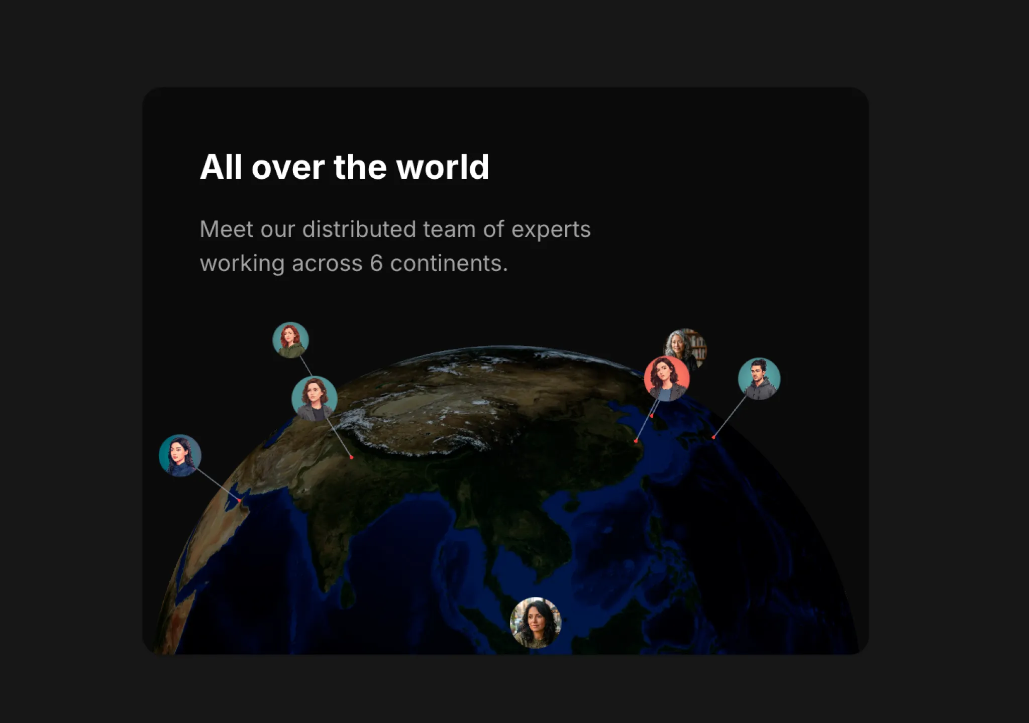
Copy this TSX component source into an AI coding tool such as Cursor, v0, or Claude, and tell it this is the Aceternity UI 3D Globe component. It can then wire it into your React project, and you can swap the copy, colors, and trigger parameters to reuse it.
Prompt
// components/ui/3d-globe.tsx "use client"; import React, { useRef, useMemo, useState, useCallback, Suspense } from "react"; import { Canvas, useFrame, useThree } from "@react-three/fiber"; import { OrbitControls, Html, useTexture } from "…
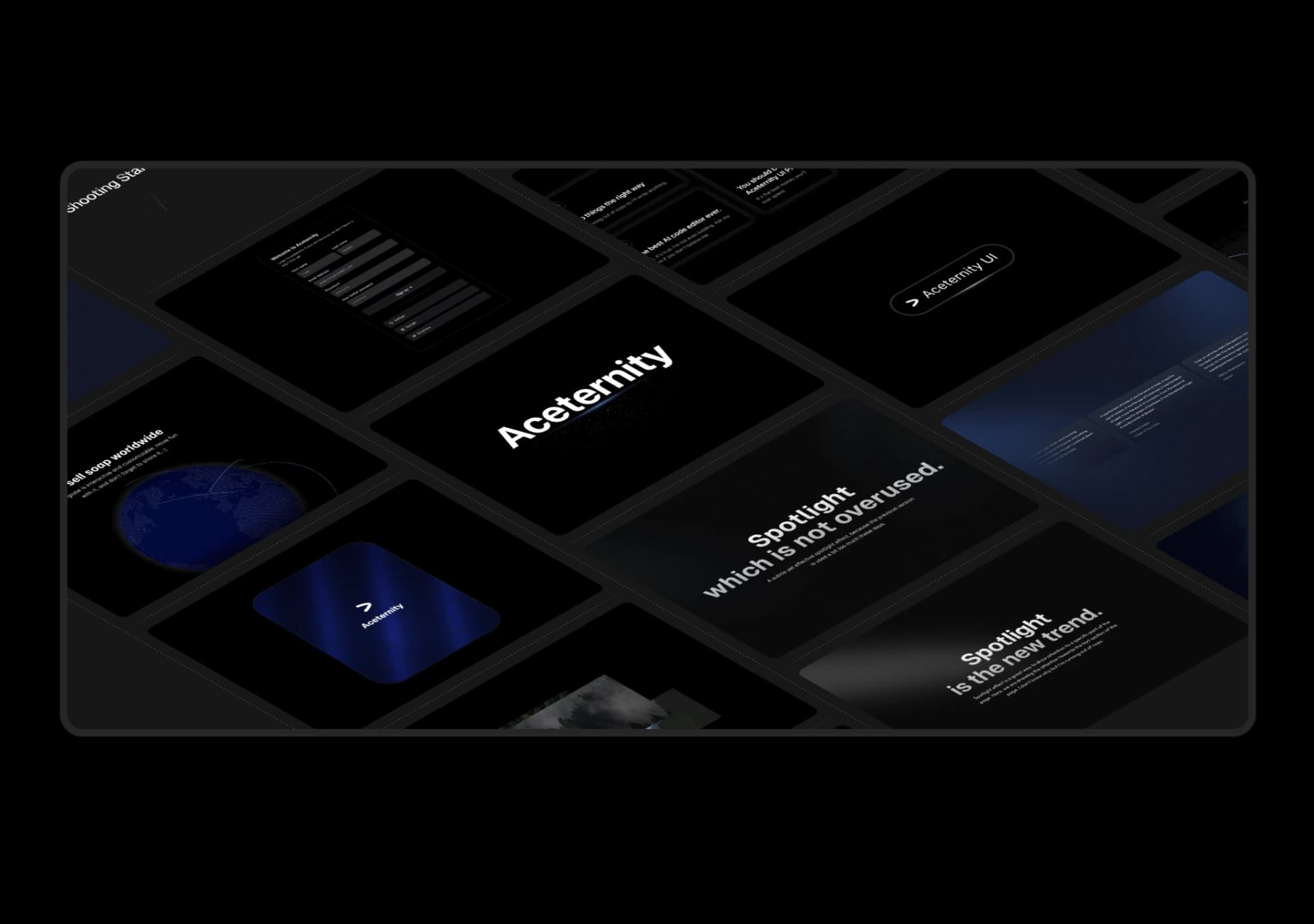
Copy this TSX component source into an AI coding tool such as Cursor, v0, or Claude, and tell it this is the Aceternity UI 3D Marquee component. It can then wire it into your React project, and you can swap the copy, colors, and trigger parameters to reuse it.
Prompt
// components/ui/3d-marquee.tsx "use client"; import { motion } from "motion/react"; import { cn } from "@/lib/utils"; export const ThreeDMarquee = ({ images, className, }: { images: string[]; className?: string; }) => { // Split the image…
Same creator
Each detail page keeps the original result, the prompt, and retest evidence in one reading path.