
加载中…
创作者 · Aceternity UI
复刻提示词保留原文,另附运行环境、素材与验收要求;附加说明不是原作者原话。
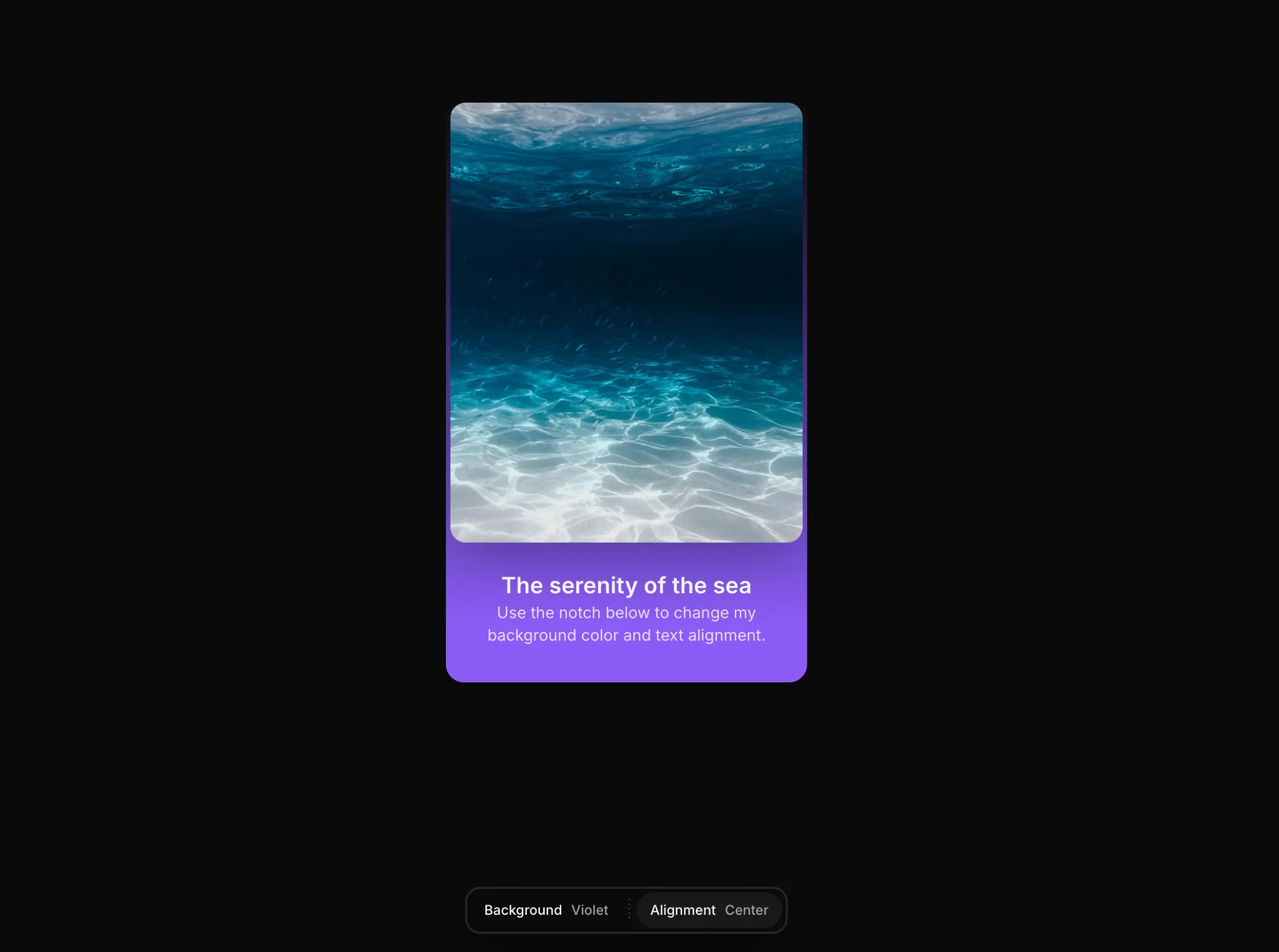
// components/ui/notch.tsx
"use client";

import React, { useEffect, useId, useRef, useState } from "react";
import { AnimatePresence, motion } from "motion/react";
import { cn } from "@/lib/utils";

export type NotchOption = {
  /** Stable identifier passed back in callbacks. */
  id: string;
  /** What renders for this option. Can be text or any node. */
  label: React.ReactNode;
  /** Optional leading node (icon, swatch, etc.) shown before the label. */
  icon?: React.ReactNode;
};

export type NotchItem = {
  /** Stable identifier for the group. */
  id: string;
  /** Trigger label shown in the bar. */
  label: React.ReactNode;
  /** Optional leading icon for the trigger. */
  icon?: React.ReactNode;
  /** The choices revealed when the group is opened. */
  options: NotchOption[];
  /** Uncontrolled initial selected option id. */
  defaultValue?: string;
  /** Controlled selected option id. */
  value?: string;
  /** Show the selected value next to the trigger label. Overrides `showSelectedValue`. */
  showValue?: boolean;
  /** Fires with the selected option whenever it changes. */
  onChange?: (optionId: string, option: NotchOption) => void;
};

export interface NotchProps {
  /** The groups shown inside the notch. Pass one or many. */
  items: NotchItem[];
  /** Pin the notch to the top or bottom of the viewport. */
  position?: "top" | "bottom";
  /** Horizontal alignment of the floating notch. */
  align?: "start" | "center" | "end";
  /** Fired for any group change, in addition to the per-item callback. */
  onItemChange?: (
    itemId: string,
    optionId: string,
    option: NotchOption,
  ) => void;
  /** Close the panel after selecting an option. */
  closeOnSelect?: boolean;
  /** Show each group's selected value next to its trigger label. */
  showSelectedValue?: boolean;
  /** Render dotted dividers between groups. */
  showDividers?: boolean;
  /** Highlight color for the selected option. Any CSS color or variable. */
  accentColor?: string;
  /** Distance from the pinned edge, in pixels. */
  offset?: number;
  /** Play the entrance animation on mount. */
  reveal?: boolean;
  /** Classes applied to the floating shell. */
  className?: string;
  /** Classes applied to every trigger. */
  itemClassName?: string;
  /** Classes applied to the options panel. */
  panelClassName?: string;
}

const SHELL_SPRING = { type: "spring" as const, stiffness: 380, damping: 34 };

const LIST_VARIANTS = {
  hidden: {},
  visible: { transition: { staggerChildren: 0.045, delayChildren: 0.08 } },
};

const OPTION_VARIANTS = {
  hidden: { opacity: 0, y: -10, filter: "blur(4px)" },
  visible: {
    opacity: 1,
    y: 0,
    filter: "blur(0px)",
    transition: { type: "spring" as const, stiffness: 420, damping: 30 },
  },
};

function NotchDivider() {
  return (
    <span
      aria-hidden
      className="mx-0.5 h-5 w-px shrink-0 self-center"
      style={{
        backgroundImage:
          "repeating-linear-gradient(180deg, rgba(255,255,255,0.35) 0px, rgba(255,255,255,0.35) 1px, transparent 1px, transparent 5px)",
        backgroundSize: "1px 4px",
        backgroundRepeat: "repeat-y",
      }}
    />
  );
}

export const Notch = ({
  items,
  position = "bottom",
  align = "center",
  onItemChange,
  closeOnSelect = true,
  showSelectedValue = true,
  showDividers = true,
  accentColor = "var(--color-blue-500, #3b82f6)",
  offset = 16,
  reveal = true,
  className,
  itemClassName,
  panelClassName,
}: NotchProps) => {
  const shellRef = useRef<HTMLDivElement>(null);
  const shellLayoutId = useId();
  const [openItemId, setOpenItemId] = useState<string | null>(null);
  const [internalSelected, setInternalSelected] = useState<
    Record<string, string>
  >(() => {
    const map: Record<string, string> = {};
    for (const item of items) {
      if (item.value === undefined) {
        map[item.id] = item.defaultValue ?? item.options[0]?.id ?? "";
      }
    }
    return map;
  });

  useEffect(() => {
    function onKey(e: KeyboardEvent) {
      if (e.key === "Escape") setOpenItemId(null);
    }
    window.addEventListener("keydown", onKey);
    return () => window.removeEventListener("keydown", onKey);
  }, []);

  useEffect(() => {
    if (!openItemId) return;
    function onPointerDown(e: PointerEvent) {
      if (!shellRef.current?.contains(e.target as Node)) setOpenItemId(null);
    }
    document.addEventListener("pointerdown", onPointerDown);
    return () => document.removeEventListener("pointerdown", onPointerDown);
  }, [openItemId]);

  const getSelectedId = (item: NotchItem) =>
    item.value ?? internalSelected[item.id] ?? item.options[0]?.id;

  const getSelectedOption = (item: NotchItem) =>
    item.options.find((o) => o.id === getSelectedId(item));

  const handleSelect = (item: NotchItem, option: NotchOption) => {
    if (item.value === undefined) {
      setInternalSelected((prev) => ({ ...prev, [item.id]: option.id }));
    }
    item.onChange?.(option.id, option);
    onItemChange?.(item.id, option.id, option);
    if (closeOnSelect) setOpenItemId(null);
  };

  const alignClass =
    align === "start"
      ? "justify-start"
      : align === "end"
        ? "justify-end"
        : "justify-center";

  const edgeOffset = (offset + 20) * (position === "top" ? -1 : 1);
  const openItem = items.find((i) => i.id === openItemId) ?? null;

  const optionsPanel = openItem ? (
    <motion.div
      key={openItem.id}
      role="listbox"
      aria-label={
        typeof openItem.label === "string" ? openItem.label : openItem.id
      }
      initial={{ opacity: 0 }}
      animate={{ opacity: 1 }}
      exit={{ opacity: 0 }}
      transition={{ duration: 0.15 }}
      className={cn("w-fit", panelClassName)}
    >
      <motion.div
        className="flex flex-col gap-1.5 p-2"
        variants={LIST_VARIANTS}
        initial="hidden"
        animate="visible"
      >
        {openItem.options.map((option) => {
          const active = option.id === getSelectedId(openItem);
          return (
            <motion.button
              key={option.id}
              role="option"
              aria-selected={active}
              type="button"
              variants={OPTION_VARIANTS}
              onClick={() => handleSelect(openItem, option)}
              className={cn(
                "flex w-full items-center justify-between gap-6 rounded-md px-3 py-2 text-left text-xs font-medium whitespace-nowrap transition-colors",
                active
                  ? "text-white"
                  : "text-neutral-300 hover:bg-white/5 hover:text-white",
              )}
              style={
                active
                  ? {
                      background: `color-mix(in oklab, ${accentColor} 85%, transparent)`,
                      boxShadow: `inset 0 0 0 1px color-mix(in oklab, ${accentColor} 40%, transparent)`,
                    }
                  : undefined
              }
            >
              <span className="flex items-center gap-2.5">
                {option.icon ? (
                  <span className="flex shrink-0 items-center justify-center">
                    {option.icon}
                  </span>
                ) : null}
                <span>{option.label}</span>
              </span>
              {active ? (
                <span
                  className="size-1.5 shrink-0 rounded-full"
                  style={{ background: accentColor }}
                />
              ) : null}
            </motion.button>
          );
        })}
      </motion.div>
    </motion.div>
  ) : (
    <motion.div
      key="__notch-triggers"
      initial={{ opacity: 0 }}
      animate={{ opacity: 1 }}
      exit={{ opacity: 0 }}
      transition={{ duration: 0.15 }}
      className="flex w-fit items-center gap-1 p-1"
    >
      {items.map((item, index) => {
        const selected = getSelectedOption(item);
        const isLast = index === items.length - 1;

        return (
          <React.Fragment key={item.id}>
            <button
              type="button"
              aria-haspopup="listbox"
              aria-expanded={false}
              onClick={() => setOpenItemId(item.id)}
              className={cn(
                "group flex items-center gap-2 rounded-full px-3 py-2 text-xs font-medium whitespace-nowrap text-neutral-300 transition-colors hover:bg-white/6 hover:text-white",
                itemClassName,
              )}
            >
              {item.icon ? (
                <span className="flex shrink-0 items-center justify-center">
                  {item.icon}
                </span>
              ) : null}
              <span className="text-neutral-100">{item.label}</span>
              {(item.showValue ?? showSelectedValue) && selected ? (
                <span className="text-neutral-400">{selected.label}</span>
              ) : null}
            </button>
            {showDividers && !isLast ? <NotchDivider /> : null}
          </React.Fragment>
        );
      })}
    </motion.div>
  );

  return (
    <div
      className={cn(
        "pointer-events-none fixed inset-x-0 z-100 flex translate-z-0 px-4",
        position === "top" ? "top-0" : "bottom-0",
        alignClass,
      )}
      style={
        position === "top"
          ? { paddingTop: `max(${offset}px, env(safe-area-inset-top))` }
          : { paddingBottom: `max(${offset}px, env(safe-area-inset-bottom))` }
      }
    >
      <motion.div
        ref={shellRef}
        layoutId={shellLayoutId}
        layout
        initial={
          reveal ? { opacity: 0, y: edgeOffset, filter: "blur(6px)" } : false
        }
        animate={{ opacity: 1, y: 0, filter: "blur(0px)" }}
        transition={SHELL_SPRING}
        className={cn(
          "pointer-events-auto flex w-fit flex-col overflow-hidden rounded-xl border border-white/10 bg-neutral-950/95 shadow-[0_12px_40px_-8px_rgba(0,0,0,0.55)] ring-1 ring-neutral-800 backdrop-blur-2xl ring-inset",
          className,
        )}
      >
        <AnimatePresence mode="popLayout" initial={false}>
          {optionsPanel}
        </AnimatePresence>
      </motion.div>
    </div>
  );
};适用模型与稳定度
建议模型
多人复现
 打开复现作品 ↗
GLM-5.3-Flash通过已付Coding套餐单次生成,未调用DeepSeek或HAO。Codex进行静态JSX编译/依赖打包及手机工具栏间距修复。桌面1440×1000和手机390×844真实渲染、选项切换、Esc关闭、点击外部关闭通过;原始单次生成曾因JSX未编译而空白,已分别保留原失败与修复后证据。未进行逐像素还原或全部属性组合验收。
复现出处 ↗ 打开复现作品 ↗
GLM-5.3 单次生成;Codex 人工修复运行依赖、必要源码及移动布局,未重新生成。桌面/手机真实渲染和资源检查通过;完整功能与视觉还原尚未全部验收。源码、截图和修复记录见复现出处。
复现出处 ↗继续探索

复制这段 TSX 组件源码,交给 Cursor、v0、Claude 等 AI 编程工具,说明这是「3D Animated Pin」的 Aceternity UI 组件实现,即可让它接入你的 React 项目,再按需替换文案、配色与触发参数复用。
提示语
// components/ui/3d-pin.tsx "use client"; import React, { useState } from "react"; import { motion } from "motion/react"; import { cn } from "@/lib/utils"; export const PinContainer = ({ children, title, href, className, containerClassName…
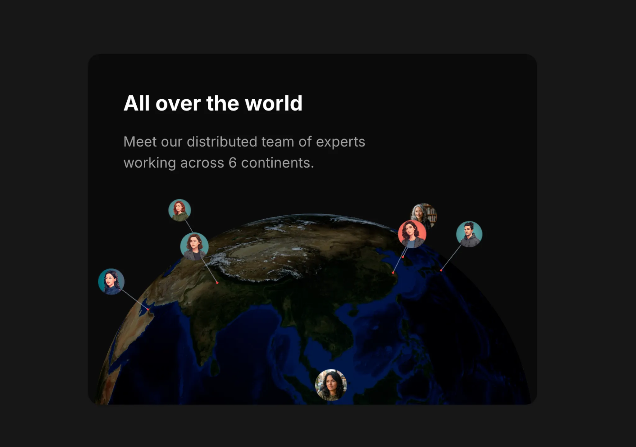
复制这段 TSX 组件源码,交给 Cursor、v0、Claude 等 AI 编程工具,说明这是「3D Globe」的 Aceternity UI 组件实现,即可让它接入你的 React 项目,再按需替换文案、配色与触发参数复用。
提示语
// components/ui/3d-globe.tsx "use client"; import React, { useRef, useMemo, useState, useCallback, Suspense } from "react"; import { Canvas, useFrame, useThree } from "@react-three/fiber"; import { OrbitControls, Html, useTexture } from "…
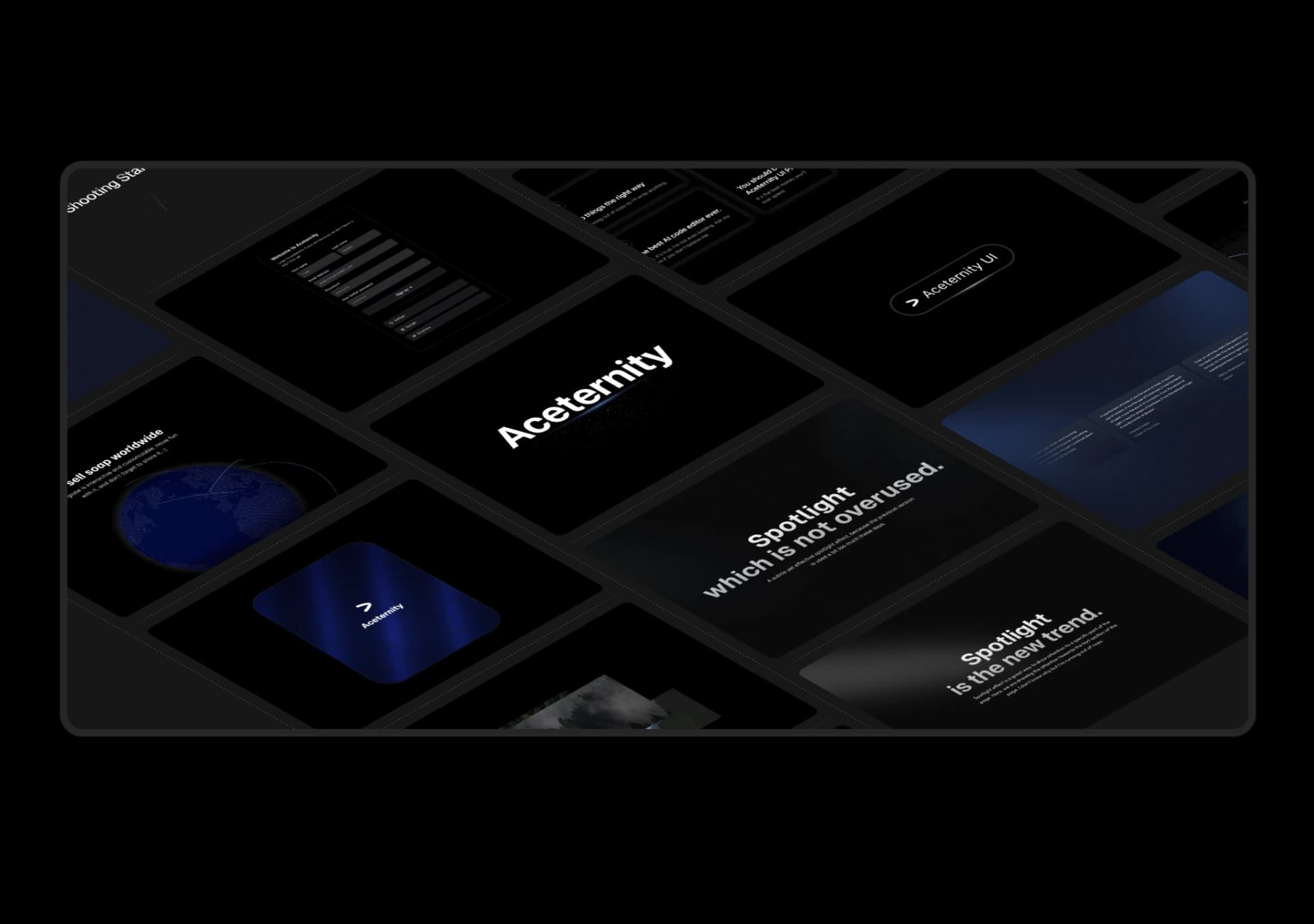
复制这段 TSX 组件源码,交给 Cursor、v0、Claude 等 AI 编程工具,说明这是「3D Marquee」的 Aceternity UI 组件实现,即可让它接入你的 React 项目,再按需替换文案、配色与触发参数复用。
提示语
// components/ui/3d-marquee.tsx "use client"; import { motion } from "motion/react"; import { cn } from "@/lib/utils"; export const ThreeDMarquee = ({ images, className, }: { images: string[]; className?: string; }) => { // Split the image…
Case 详情页把原帖效果、Prompt 与复测证据放在同一条阅读路径里。