
Loading…
Loading…
Creator · Aceternity UI
The reproduction prompt keeps the original and adds runtime, asset and acceptance requirements. These additions are not the author’s words.
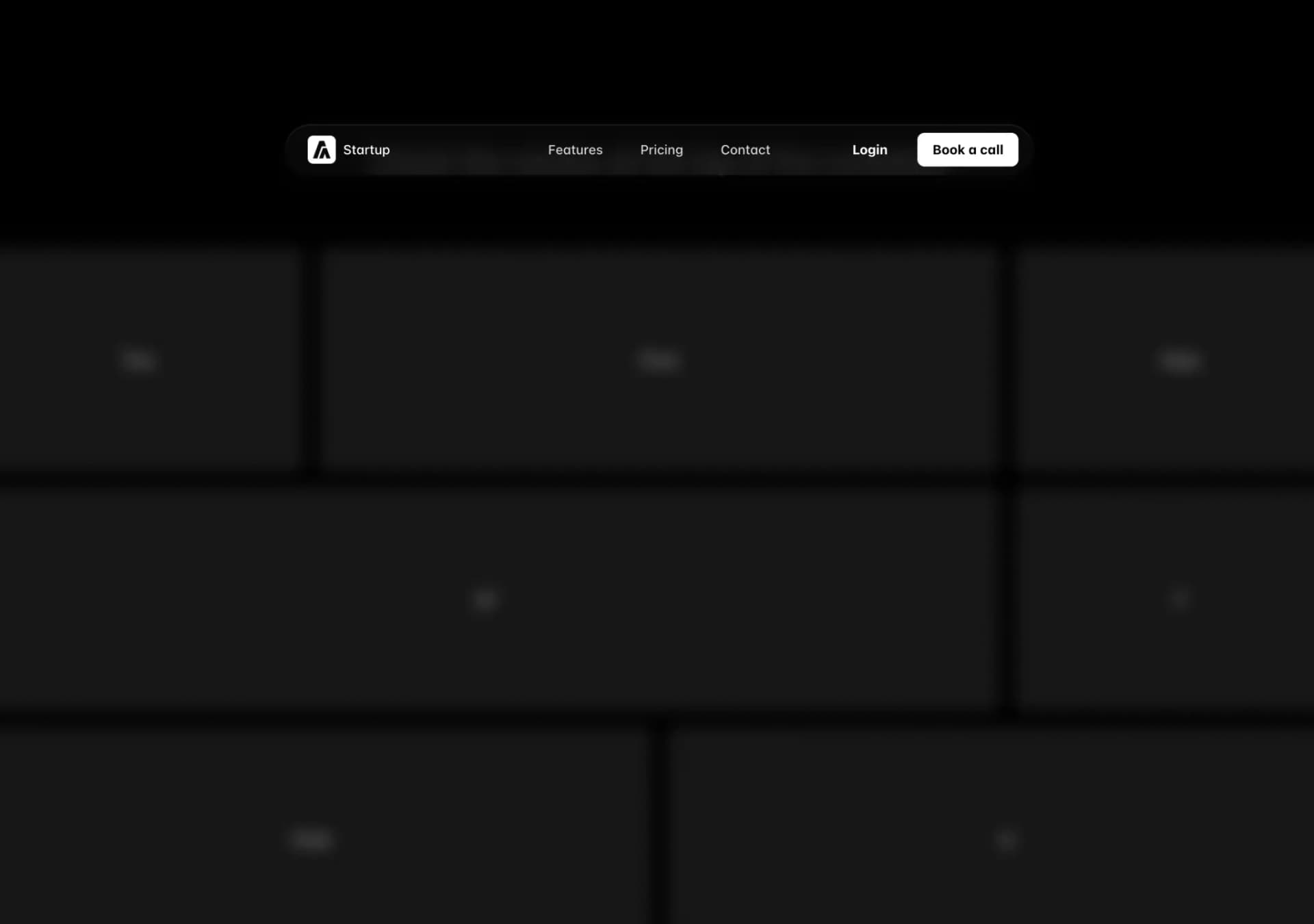
// components/ui/resizable-navbar.tsx
"use client";
import { cn } from "@/lib/utils";
import { IconMenu2, IconX } from "@tabler/icons-react";
import {
  motion,
  AnimatePresence,
  useScroll,
  useMotionValueEvent,
} from "motion/react";

import React, { useRef, useState } from "react";


interface NavbarProps {
  children: React.ReactNode;
  className?: string;
}

interface NavBodyProps {
  children: React.ReactNode;
  className?: string;
  visible?: boolean;
}

interface NavItemsProps {
  items: {
    name: string;
    link: string;
  }[];
  className?: string;
  onItemClick?: () => void;
}

interface MobileNavProps {
  children: React.ReactNode;
  className?: string;
  visible?: boolean;
}

interface MobileNavHeaderProps {
  children: React.ReactNode;
  className?: string;
}

interface MobileNavMenuProps {
  children: React.ReactNode;
  className?: string;
  isOpen: boolean;
  onClose: () => void;
}

export const Navbar = ({ children, className }: NavbarProps) => {
  const ref = useRef<HTMLDivElement>(null);
  const { scrollY } = useScroll({
    target: ref,
    offset: ["start start", "end start"],
  });
  const [visible, setVisible] = useState<boolean>(false);

  useMotionValueEvent(scrollY, "change", (latest) => {
    if (latest > 100) {
      setVisible(true);
    } else {
      setVisible(false);
    }
  });

  return (
    <motion.div
      ref={ref}
      // IMPORTANT: Change this to class of `fixed` if you want the navbar to be fixed
      className={cn("sticky inset-x-0 top-20 z-40 w-full", className)}
    >
      {React.Children.map(children, (child) =>
        React.isValidElement(child)
          ? React.cloneElement(
              child as React.ReactElement<{ visible?: boolean }>,
              { visible },
            )
          : child,
      )}
    </motion.div>
  );
};

export const NavBody = ({ children, className, visible }: NavBodyProps) => {
  return (
    <motion.div
      animate={{
        backdropFilter: visible ? "blur(10px)" : "none",
        boxShadow: visible
          ? "0 0 24px rgba(34, 42, 53, 0.06), 0 1px 1px rgba(0, 0, 0, 0.05), 0 0 0 1px rgba(34, 42, 53, 0.04), 0 0 4px rgba(34, 42, 53, 0.08), 0 16px 68px rgba(47, 48, 55, 0.05), 0 1px 0 rgba(255, 255, 255, 0.1) inset"
          : "none",
        width: visible ? "40%" : "100%",
        y: visible ? 20 : 0,
      }}
      transition={{
        type: "spring",
        stiffness: 200,
        damping: 50,
      }}
      style={{
        minWidth: "800px",
      }}
      className={cn(
        "relative z-[60] mx-auto hidden w-full max-w-7xl flex-row items-center justify-between self-start rounded-full bg-transparent px-4 py-2 lg:flex dark:bg-transparent",
        visible && "bg-white/80 dark:bg-neutral-950/80",
        className,
      )}
    >
      {children}
    </motion.div>
  );
};

export const NavItems = ({ items, className, onItemClick }: NavItemsProps) => {
  const [hovered, setHovered] = useState<number | null>(null);

  return (
    <motion.div
      onMouseLeave={() => setHovered(null)}
      className={cn(
        "absolute inset-0 hidden flex-1 flex-row items-center justify-center space-x-2 text-sm font-medium text-zinc-600 transition duration-200 hover:text-zinc-800 lg:flex lg:space-x-2",
        className,
      )}
    >
      {items.map((item, idx) => (
        <a
          onMouseEnter={() => setHovered(idx)}
          onClick={onItemClick}
          className="relative px-4 py-2 text-neutral-600 dark:text-neutral-300"
          key={`link-${idx}`}
          href={item.link}
        >
          {hovered === idx && (
            <motion.div
              layoutId="hovered"
              className="absolute inset-0 h-full w-full rounded-full bg-gray-100 dark:bg-neutral-800"
            />
          )}
          <span className="relative z-20">{item.name}</span>
        </a>
      ))}
    </motion.div>
  );
};

export const MobileNav = ({ children, className, visible }: MobileNavProps) => {
  return (
    <motion.div
      animate={{
        backdropFilter: visible ? "blur(10px)" : "none",
        boxShadow: visible
          ? "0 0 24px rgba(34, 42, 53, 0.06), 0 1px 1px rgba(0, 0, 0, 0.05), 0 0 0 1px rgba(34, 42, 53, 0.04), 0 0 4px rgba(34, 42, 53, 0.08), 0 16px 68px rgba(47, 48, 55, 0.05), 0 1px 0 rgba(255, 255, 255, 0.1) inset"
          : "none",
        width: visible ? "90%" : "100%",
        paddingRight: visible ? "12px" : "0px",
        paddingLeft: visible ? "12px" : "0px",
        borderRadius: visible ? "4px" : "2rem",
        y: visible ? 20 : 0,
      }}
      transition={{
        type: "spring",
        stiffness: 200,
        damping: 50,
      }}
      className={cn(
        "relative z-50 mx-auto flex w-full max-w-[calc(100vw-2rem)] flex-col items-center justify-between bg-transparent px-0 py-2 lg:hidden",
        visible && "bg-white/80 dark:bg-neutral-950/80",
        className,
      )}
    >
      {children}
    </motion.div>
  );
};

export const MobileNavHeader = ({
  children,
  className,
}: MobileNavHeaderProps) => {
  return (
    <div
      className={cn(
        "flex w-full flex-row items-center justify-between",
        className,
      )}
    >
      {children}
    </div>
  );
};

export const MobileNavMenu = ({
  children,
  className,
  isOpen,
  onClose,
}: MobileNavMenuProps) => {
  return (
    <AnimatePresence>
      {isOpen && (
        <motion.div
          initial={{ opacity: 0 }}
          animate={{ opacity: 1 }}
          exit={{ opacity: 0 }}
          className={cn(
            "absolute inset-x-0 top-16 z-50 flex w-full flex-col items-start justify-start gap-4 rounded-lg bg-white px-4 py-8 shadow-[0_0_24px_rgba(34,_42,_53,_0.06),_0_1px_1px_rgba(0,_0,_0,_0.05),_0_0_0_1px_rgba(34,_42,_53,_0.04),_0_0_4px_rgba(34,_42,_53,_0.08),_0_16px_68px_rgba(47,_48,_55,_0.05),_0_1px_0_rgba(255,_255,_255,_0.1)_inset] dark:bg-neutral-950",
            className,
          )}
        >
          {children}
        </motion.div>
      )}
    </AnimatePresence>
  );
};

export const MobileNavToggle = ({
  isOpen,
  onClick,
}: {
  isOpen: boolean;
  onClick: () => void;
}) => {
  return isOpen ? (
    <IconX className="text-black dark:text-white" onClick={onClick} />
  ) : (
    <IconMenu2 className="text-black dark:text-white" onClick={onClick} />
  );
};

export const NavbarLogo = () => {
  return (
    <a
      href="#"
      className="relative z-20 mr-4 flex items-center space-x-2 px-2 py-1 text-sm font-normal text-black"
    >
      <img
        src="https://assets.aceternity.com/logo-dark.png"
        alt="logo"
        width={30}
        height={30}
      />
      <span className="font-medium text-black dark:text-white">Startup</span>
    </a>
  );
};

export const NavbarButton = ({
  href,
  as: Tag = "a",
  children,
  className,
  variant = "primary",
  ...props
}: {
  href?: string;
  as?: React.ElementType;
  children: React.ReactNode;
  className?: string;
  variant?: "primary" | "secondary" | "dark" | "gradient";
} & (
  | React.ComponentPropsWithoutRef<"a">
  | React.ComponentPropsWithoutRef<"button">
)) => {
  const baseStyles =
    "px-4 py-2 rounded-md bg-white button bg-white text-black text-sm font-bold relative cursor-pointer hover:-translate-y-0.5 transition duration-200 inline-block text-center";

  const variantStyles = {
    primary:
      "shadow-[0_0_24px_rgba(34,_42,_53,_0.06),_0_1px_1px_rgba(0,_0,_0,_0.05),_0_0_0_1px_rgba(34,_42,_53,_0.04),_0_0_4px_rgba(34,_42,_53,_0.08),_0_16px_68px_rgba(47,_48,_55,_0.05),_0_1px_0_rgba(255,_255,_255,_0.1)_inset]",
    secondary: "bg-transparent shadow-none dark:text-white",
    dark: "bg-black text-white shadow-[0_0_24px_rgba(34,_42,_53,_0.06),_0_1px_1px_rgba(0,_0,_0,_0.05),_0_0_0_1px_rgba(34,_42,_53,_0.04),_0_0_4px_rgba(34,_42,_53,_0.08),_0_16px_68px_rgba(47,_48,_55,_0.05),_0_1px_0_rgba(255,_255,_255,_0.1)_inset]",
    gradient:
      "bg-gradient-to-b from-blue-500 to-blue-700 text-white shadow-[0px_2px_0px_0px_rgba(255,255,255,0.3)_inset]",
  };

  return (
    <Tag
      href={href || undefined}
      className={cn(baseStyles, variantStyles[variant], className)}
      {...props}
    >
      {children}
    </Tag>
  );
};Models & stability
Recommended models
Independent reproductions
 Open reproduction ↗
GLM-5.3 单次生成;Codex 人工修复运行依赖、必要源码及移动布局,未重新生成。桌面/手机真实渲染和资源检查通过;完整功能与视觉还原尚未全部验收。源码、截图和修复记录见复现出处。
Reproduction source ↗Keep exploring

Copy this TSX component source into an AI coding tool such as Cursor, v0, or Claude, and tell it this is the Aceternity UI 3D Animated Pin component. It can then wire it into your React project, and you can swap the copy, colors, and trigger parameters to reuse it.
Prompt
// components/ui/3d-pin.tsx "use client"; import React, { useState } from "react"; import { motion } from "motion/react"; import { cn } from "@/lib/utils"; export const PinContainer = ({ children, title, href, className, containerClassName…
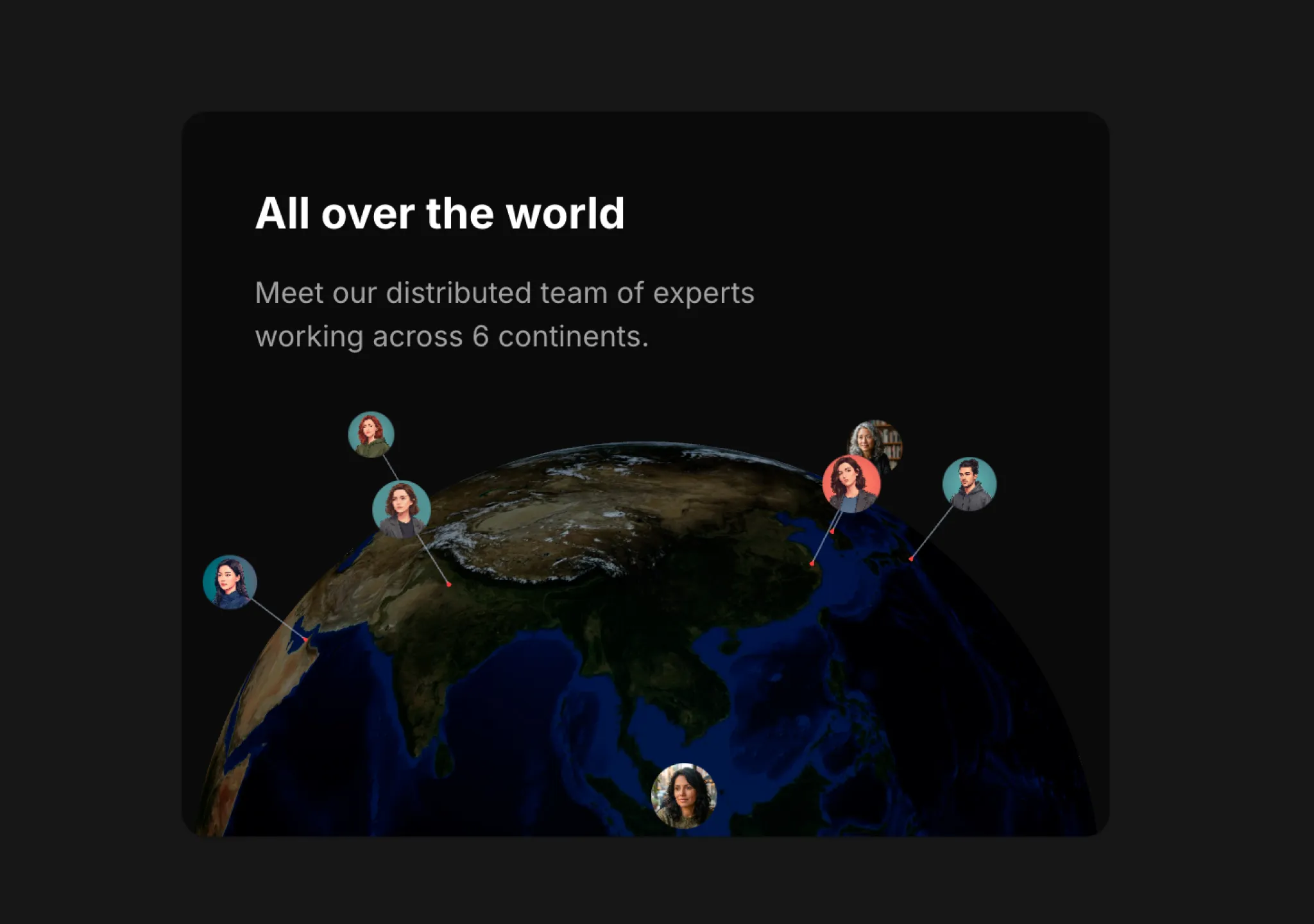
Copy this TSX component source into an AI coding tool such as Cursor, v0, or Claude, and tell it this is the Aceternity UI 3D Globe component. It can then wire it into your React project, and you can swap the copy, colors, and trigger parameters to reuse it.
Prompt
// components/ui/3d-globe.tsx "use client"; import React, { useRef, useMemo, useState, useCallback, Suspense } from "react"; import { Canvas, useFrame, useThree } from "@react-three/fiber"; import { OrbitControls, Html, useTexture } from "…
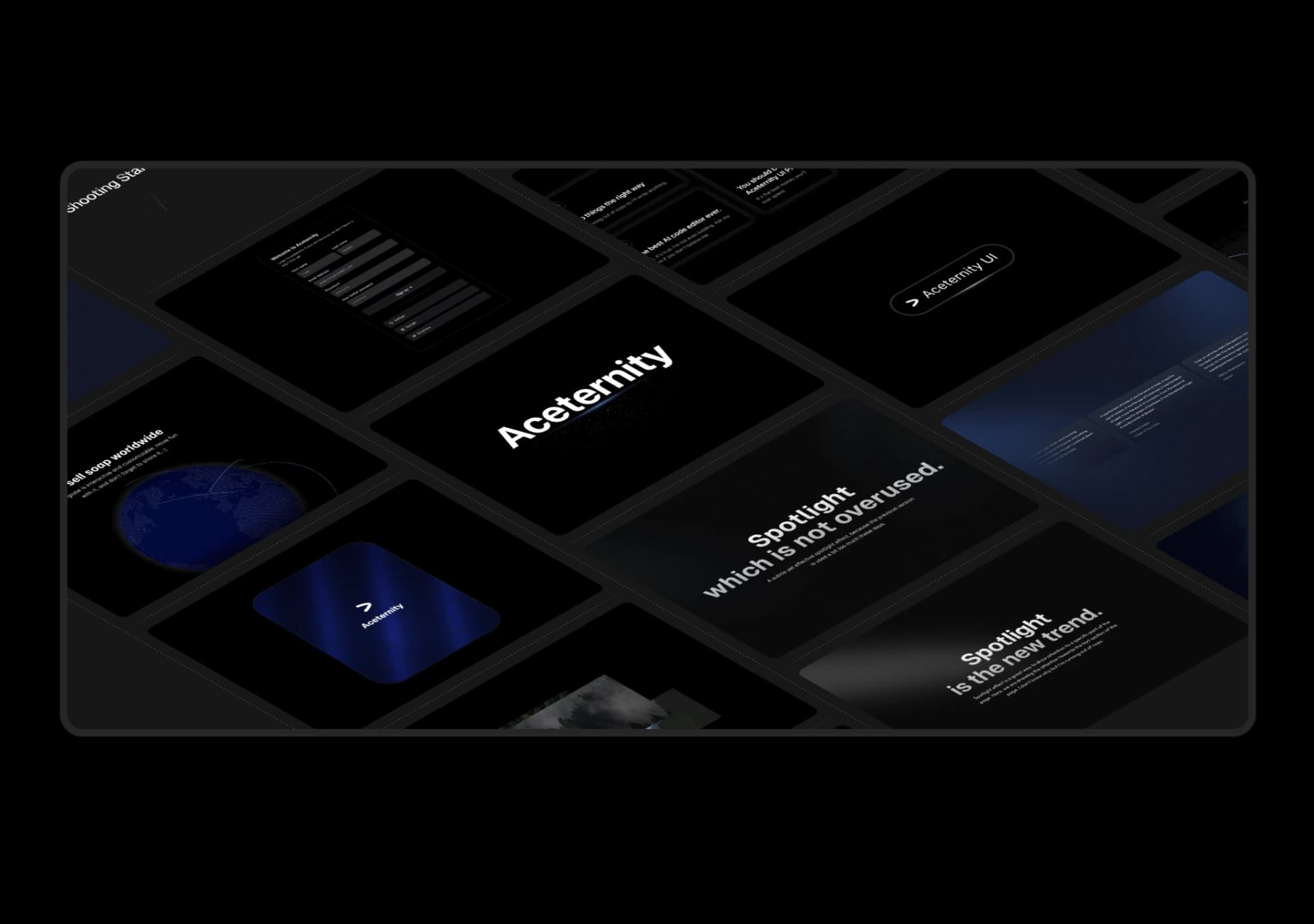
Copy this TSX component source into an AI coding tool such as Cursor, v0, or Claude, and tell it this is the Aceternity UI 3D Marquee component. It can then wire it into your React project, and you can swap the copy, colors, and trigger parameters to reuse it.
Prompt
// components/ui/3d-marquee.tsx "use client"; import { motion } from "motion/react"; import { cn } from "@/lib/utils"; export const ThreeDMarquee = ({ images, className, }: { images: string[]; className?: string; }) => { // Split the image…
Same creator
Each detail page keeps the original result, the prompt, and retest evidence in one reading path.