
加载中…
创作者 · Aceternity UI
复刻提示词保留原文,另附运行环境、素材与验收要求;附加说明不是原作者原话。
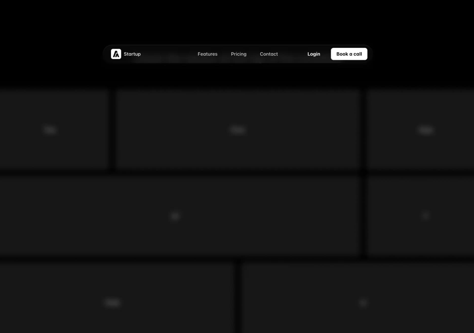
// components/ui/resizable-navbar.tsx
"use client";
import { cn } from "@/lib/utils";
import { IconMenu2, IconX } from "@tabler/icons-react";
import {
  motion,
  AnimatePresence,
  useScroll,
  useMotionValueEvent,
} from "motion/react";

import React, { useRef, useState } from "react";


interface NavbarProps {
  children: React.ReactNode;
  className?: string;
}

interface NavBodyProps {
  children: React.ReactNode;
  className?: string;
  visible?: boolean;
}

interface NavItemsProps {
  items: {
    name: string;
    link: string;
  }[];
  className?: string;
  onItemClick?: () => void;
}

interface MobileNavProps {
  children: React.ReactNode;
  className?: string;
  visible?: boolean;
}

interface MobileNavHeaderProps {
  children: React.ReactNode;
  className?: string;
}

interface MobileNavMenuProps {
  children: React.ReactNode;
  className?: string;
  isOpen: boolean;
  onClose: () => void;
}

export const Navbar = ({ children, className }: NavbarProps) => {
  const ref = useRef<HTMLDivElement>(null);
  const { scrollY } = useScroll({
    target: ref,
    offset: ["start start", "end start"],
  });
  const [visible, setVisible] = useState<boolean>(false);

  useMotionValueEvent(scrollY, "change", (latest) => {
    if (latest > 100) {
      setVisible(true);
    } else {
      setVisible(false);
    }
  });

  return (
    <motion.div
      ref={ref}
      // IMPORTANT: Change this to class of `fixed` if you want the navbar to be fixed
      className={cn("sticky inset-x-0 top-20 z-40 w-full", className)}
    >
      {React.Children.map(children, (child) =>
        React.isValidElement(child)
          ? React.cloneElement(
              child as React.ReactElement<{ visible?: boolean }>,
              { visible },
            )
          : child,
      )}
    </motion.div>
  );
};

export const NavBody = ({ children, className, visible }: NavBodyProps) => {
  return (
    <motion.div
      animate={{
        backdropFilter: visible ? "blur(10px)" : "none",
        boxShadow: visible
          ? "0 0 24px rgba(34, 42, 53, 0.06), 0 1px 1px rgba(0, 0, 0, 0.05), 0 0 0 1px rgba(34, 42, 53, 0.04), 0 0 4px rgba(34, 42, 53, 0.08), 0 16px 68px rgba(47, 48, 55, 0.05), 0 1px 0 rgba(255, 255, 255, 0.1) inset"
          : "none",
        width: visible ? "40%" : "100%",
        y: visible ? 20 : 0,
      }}
      transition={{
        type: "spring",
        stiffness: 200,
        damping: 50,
      }}
      style={{
        minWidth: "800px",
      }}
      className={cn(
        "relative z-[60] mx-auto hidden w-full max-w-7xl flex-row items-center justify-between self-start rounded-full bg-transparent px-4 py-2 lg:flex dark:bg-transparent",
        visible && "bg-white/80 dark:bg-neutral-950/80",
        className,
      )}
    >
      {children}
    </motion.div>
  );
};

export const NavItems = ({ items, className, onItemClick }: NavItemsProps) => {
  const [hovered, setHovered] = useState<number | null>(null);

  return (
    <motion.div
      onMouseLeave={() => setHovered(null)}
      className={cn(
        "absolute inset-0 hidden flex-1 flex-row items-center justify-center space-x-2 text-sm font-medium text-zinc-600 transition duration-200 hover:text-zinc-800 lg:flex lg:space-x-2",
        className,
      )}
    >
      {items.map((item, idx) => (
        <a
          onMouseEnter={() => setHovered(idx)}
          onClick={onItemClick}
          className="relative px-4 py-2 text-neutral-600 dark:text-neutral-300"
          key={`link-${idx}`}
          href={item.link}
        >
          {hovered === idx && (
            <motion.div
              layoutId="hovered"
              className="absolute inset-0 h-full w-full rounded-full bg-gray-100 dark:bg-neutral-800"
            />
          )}
          <span className="relative z-20">{item.name}</span>
        </a>
      ))}
    </motion.div>
  );
};

export const MobileNav = ({ children, className, visible }: MobileNavProps) => {
  return (
    <motion.div
      animate={{
        backdropFilter: visible ? "blur(10px)" : "none",
        boxShadow: visible
          ? "0 0 24px rgba(34, 42, 53, 0.06), 0 1px 1px rgba(0, 0, 0, 0.05), 0 0 0 1px rgba(34, 42, 53, 0.04), 0 0 4px rgba(34, 42, 53, 0.08), 0 16px 68px rgba(47, 48, 55, 0.05), 0 1px 0 rgba(255, 255, 255, 0.1) inset"
          : "none",
        width: visible ? "90%" : "100%",
        paddingRight: visible ? "12px" : "0px",
        paddingLeft: visible ? "12px" : "0px",
        borderRadius: visible ? "4px" : "2rem",
        y: visible ? 20 : 0,
      }}
      transition={{
        type: "spring",
        stiffness: 200,
        damping: 50,
      }}
      className={cn(
        "relative z-50 mx-auto flex w-full max-w-[calc(100vw-2rem)] flex-col items-center justify-between bg-transparent px-0 py-2 lg:hidden",
        visible && "bg-white/80 dark:bg-neutral-950/80",
        className,
      )}
    >
      {children}
    </motion.div>
  );
};

export const MobileNavHeader = ({
  children,
  className,
}: MobileNavHeaderProps) => {
  return (
    <div
      className={cn(
        "flex w-full flex-row items-center justify-between",
        className,
      )}
    >
      {children}
    </div>
  );
};

export const MobileNavMenu = ({
  children,
  className,
  isOpen,
  onClose,
}: MobileNavMenuProps) => {
  return (
    <AnimatePresence>
      {isOpen && (
        <motion.div
          initial={{ opacity: 0 }}
          animate={{ opacity: 1 }}
          exit={{ opacity: 0 }}
          className={cn(
            "absolute inset-x-0 top-16 z-50 flex w-full flex-col items-start justify-start gap-4 rounded-lg bg-white px-4 py-8 shadow-[0_0_24px_rgba(34,_42,_53,_0.06),_0_1px_1px_rgba(0,_0,_0,_0.05),_0_0_0_1px_rgba(34,_42,_53,_0.04),_0_0_4px_rgba(34,_42,_53,_0.08),_0_16px_68px_rgba(47,_48,_55,_0.05),_0_1px_0_rgba(255,_255,_255,_0.1)_inset] dark:bg-neutral-950",
            className,
          )}
        >
          {children}
        </motion.div>
      )}
    </AnimatePresence>
  );
};

export const MobileNavToggle = ({
  isOpen,
  onClick,
}: {
  isOpen: boolean;
  onClick: () => void;
}) => {
  return isOpen ? (
    <IconX className="text-black dark:text-white" onClick={onClick} />
  ) : (
    <IconMenu2 className="text-black dark:text-white" onClick={onClick} />
  );
};

export const NavbarLogo = () => {
  return (
    <a
      href="#"
      className="relative z-20 mr-4 flex items-center space-x-2 px-2 py-1 text-sm font-normal text-black"
    >
      <img
        src="https://assets.aceternity.com/logo-dark.png"
        alt="logo"
        width={30}
        height={30}
      />
      <span className="font-medium text-black dark:text-white">Startup</span>
    </a>
  );
};

export const NavbarButton = ({
  href,
  as: Tag = "a",
  children,
  className,
  variant = "primary",
  ...props
}: {
  href?: string;
  as?: React.ElementType;
  children: React.ReactNode;
  className?: string;
  variant?: "primary" | "secondary" | "dark" | "gradient";
} & (
  | React.ComponentPropsWithoutRef<"a">
  | React.ComponentPropsWithoutRef<"button">
)) => {
  const baseStyles =
    "px-4 py-2 rounded-md bg-white button bg-white text-black text-sm font-bold relative cursor-pointer hover:-translate-y-0.5 transition duration-200 inline-block text-center";

  const variantStyles = {
    primary:
      "shadow-[0_0_24px_rgba(34,_42,_53,_0.06),_0_1px_1px_rgba(0,_0,_0,_0.05),_0_0_0_1px_rgba(34,_42,_53,_0.04),_0_0_4px_rgba(34,_42,_53,_0.08),_0_16px_68px_rgba(47,_48,_55,_0.05),_0_1px_0_rgba(255,_255,_255,_0.1)_inset]",
    secondary: "bg-transparent shadow-none dark:text-white",
    dark: "bg-black text-white shadow-[0_0_24px_rgba(34,_42,_53,_0.06),_0_1px_1px_rgba(0,_0,_0,_0.05),_0_0_0_1px_rgba(34,_42,_53,_0.04),_0_0_4px_rgba(34,_42,_53,_0.08),_0_16px_68px_rgba(47,_48,_55,_0.05),_0_1px_0_rgba(255,_255,_255,_0.1)_inset]",
    gradient:
      "bg-gradient-to-b from-blue-500 to-blue-700 text-white shadow-[0px_2px_0px_0px_rgba(255,255,255,0.3)_inset]",
  };

  return (
    <Tag
      href={href || undefined}
      className={cn(baseStyles, variantStyles[variant], className)}
      {...props}
    >
      {children}
    </Tag>
  );
};适用模型与稳定度
建议模型
多人复现
继续探索

复制这段 TSX 组件源码,交给 Cursor、v0、Claude 等 AI 编程工具,说明这是「3D Animated Pin」的 Aceternity UI 组件实现,即可让它接入你的 React 项目,再按需替换文案、配色与触发参数复用。
提示语
// components/ui/3d-pin.tsx "use client"; import React, { useState } from "react"; import { motion } from "motion/react"; import { cn } from "@/lib/utils"; export const PinContainer = ({ children, title, href, className, containerClassName…
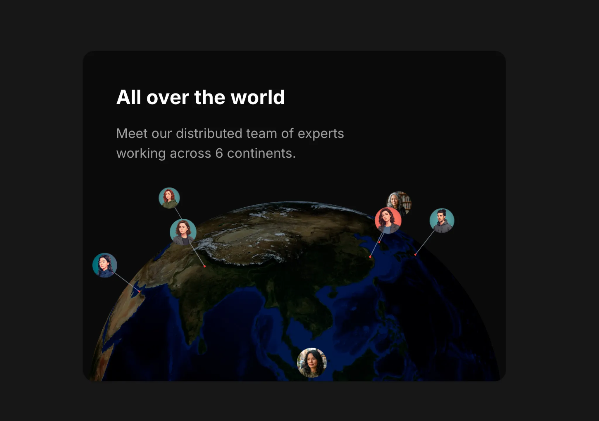
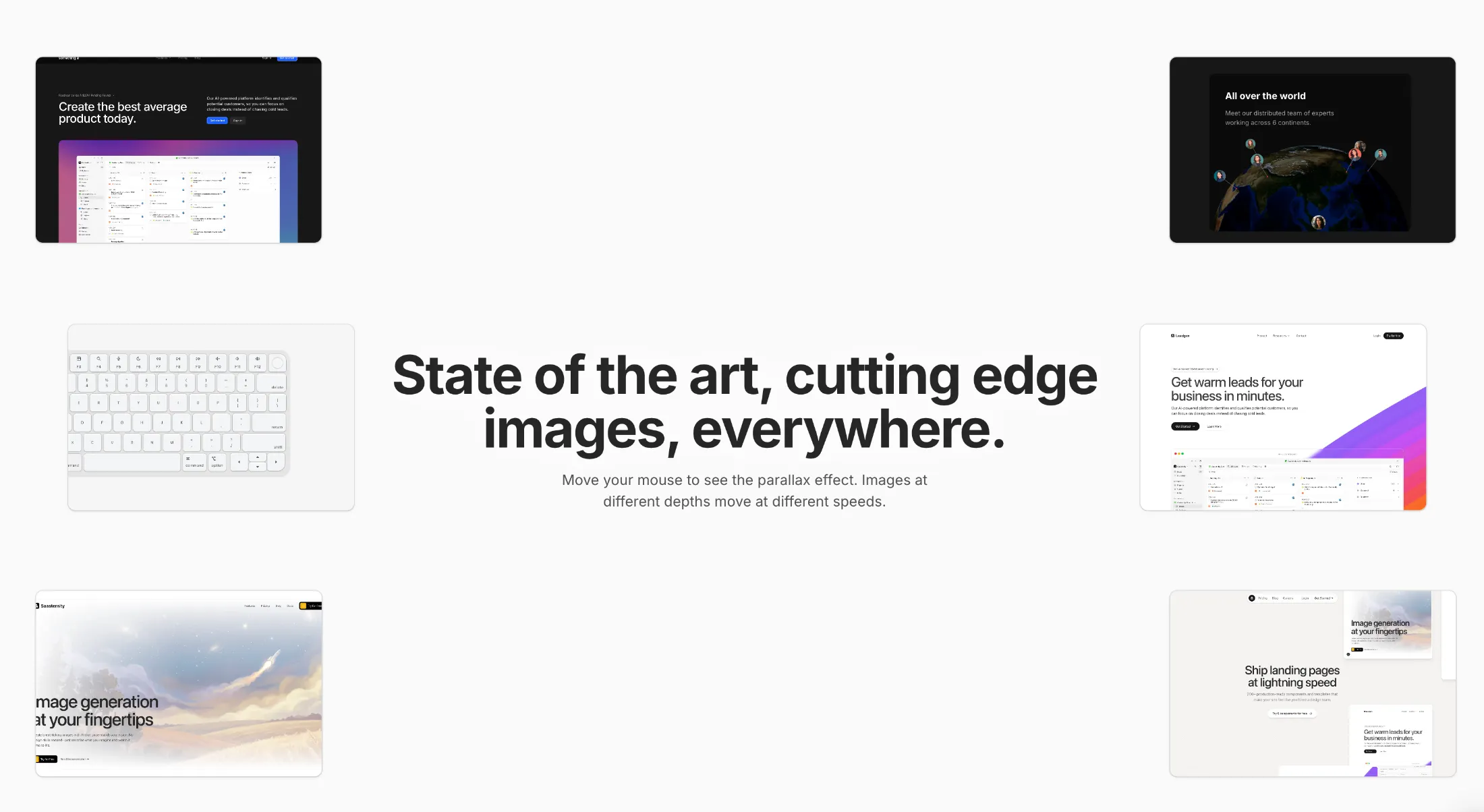
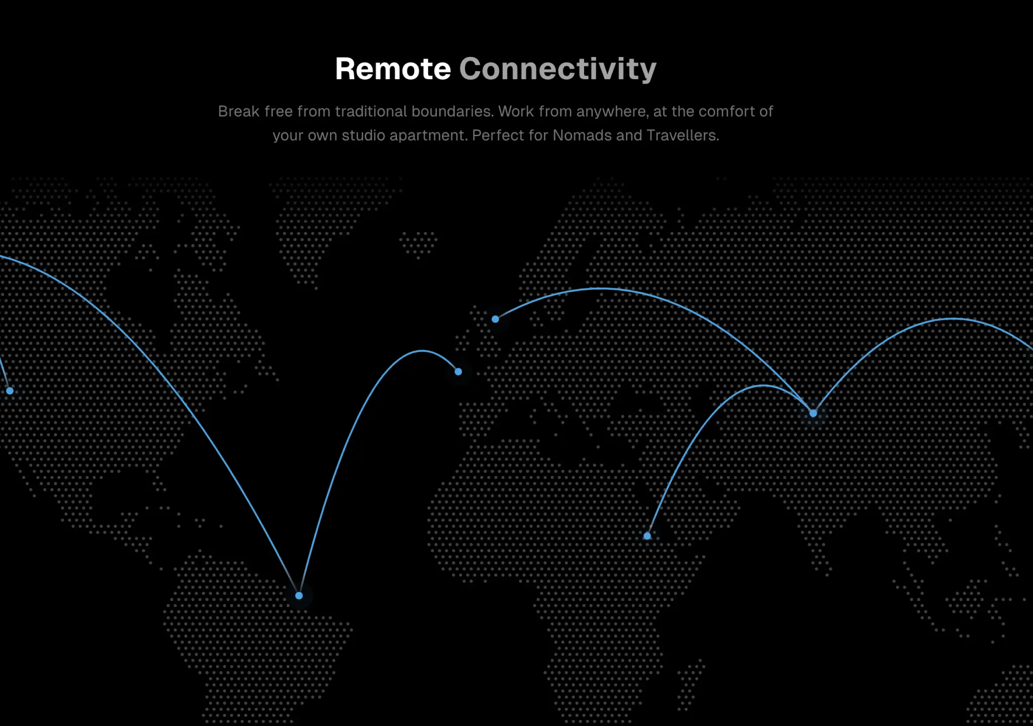
复制这段 TSX 组件源码,交给 Cursor、v0、Claude 等 AI 编程工具,说明这是「3D Globe」的 Aceternity UI 组件实现,即可让它接入你的 React 项目,再按需替换文案、配色与触发参数复用。
提示语
// components/ui/3d-globe.tsx "use client"; import React, { useRef, useMemo, useState, useCallback, Suspense } from "react"; import { Canvas, useFrame, useThree } from "@react-three/fiber"; import { OrbitControls, Html, useTexture } from "…
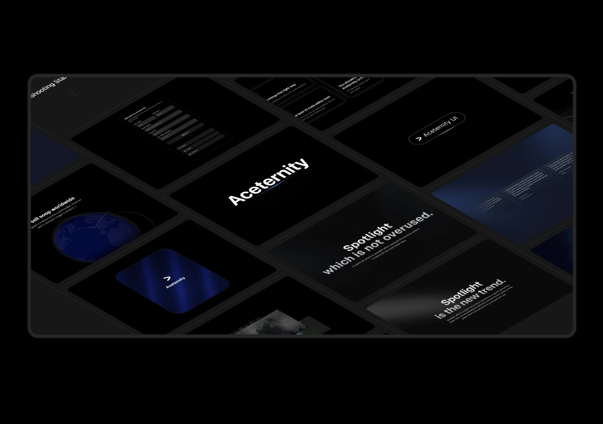
复制这段 TSX 组件源码,交给 Cursor、v0、Claude 等 AI 编程工具,说明这是「3D Marquee」的 Aceternity UI 组件实现,即可让它接入你的 React 项目,再按需替换文案、配色与触发参数复用。
提示语
// components/ui/3d-marquee.tsx "use client"; import { motion } from "motion/react"; import { cn } from "@/lib/utils"; export const ThreeDMarquee = ({ images, className, }: { images: string[]; className?: string; }) => { // Split the image…
Case 详情页把原帖效果、Prompt 与复测证据放在同一条阅读路径里。