加载中…
创作者 · Aceternity UI
查看原始来源 ↗
Prompt
// components/ui/stateful-button.tsx
"use client";
import { cn } from "@/lib/utils";
import React from "react";
import { motion, AnimatePresence, useAnimate } from "motion/react";

interface ButtonProps extends React.ButtonHTMLAttributes<HTMLButtonElement> {
  className?: string;
  children: React.ReactNode;
}

export const Button = ({ className, children, ...props }: ButtonProps) => {
  const [scope, animate] = useAnimate();

  const animateLoading = async () => {
    await animate(
      ".loader",
      {
        width: "20px",
        scale: 1,
        display: "block",
      },
      {
        duration: 0.2,
      },
    );
  };

  const animateSuccess = async () => {
    await animate(
      ".loader",
      {
        width: "0px",
        scale: 0,
        display: "none",
      },
      {
        duration: 0.2,
      },
    );
    await animate(
      ".check",
      {
        width: "20px",
        scale: 1,
        display: "block",
      },
      {
        duration: 0.2,
      },
    );

    await animate(
      ".check",
      {
        width: "0px",
        scale: 0,
        display: "none",
      },
      {
        delay: 2,
        duration: 0.2,
      },
    );
  };

  const handleClick = async (event: React.MouseEvent<HTMLButtonElement>) => {
    await animateLoading();
    await props.onClick?.(event);
    await animateSuccess();
  };

  const {
    onClick,
    onDrag,
    onDragStart,
    onDragEnd,
    onAnimationStart,
    onAnimationEnd,
    ...buttonProps
  } = props;

  return (
    <motion.button
      layout
      layoutId="button"
      ref={scope}
      className={cn(
        "flex min-w-[120px] cursor-pointer items-center justify-center gap-2 rounded-full bg-green-500 px-4 py-2 font-medium text-white ring-offset-2 transition duration-200 hover:ring-2 hover:ring-green-500 dark:ring-offset-black",
        className,
      )}
      {...buttonProps}
      onClick={handleClick}
    >
      <motion.div layout className="flex items-center gap-2">
        <Loader />
        <CheckIcon />
        <motion.span layout>{children}</motion.span>
      </motion.div>
    </motion.button>
  );
};

const Loader = () => {
  return (
    <motion.svg
      animate={{
        rotate: [0, 360],
      }}
      initial={{
        scale: 0,
        width: 0,
        display: "none",
      }}
      style={{
        scale: 0.5,
        display: "none",
      }}
      transition={{
        duration: 0.3,
        repeat: Infinity,
        ease: "linear",
      }}
      xmlns="http://www.w3.org/2000/svg"
      width="24"
      height="24"
      viewBox="0 0 24 24"
      fill="none"
      stroke="currentColor"
      strokeWidth="2"
      strokeLinecap="round"
      strokeLinejoin="round"
      className="loader text-white"
    >
      <path stroke="none" d="M0 0h24v24H0z" fill="none" />
      <path d="M12 3a9 9 0 1 0 9 9" />
    </motion.svg>
  );
};

const CheckIcon = () => {
  return (
    <motion.svg
      initial={{
        scale: 0,
        width: 0,
        display: "none",
      }}
      style={{
        scale: 0.5,
        display: "none",
      }}
      xmlns="http://www.w3.org/2000/svg"
      width="24"
      height="24"
      viewBox="0 0 24 24"
      fill="none"
      stroke="currentColor"
      strokeWidth="2"
      strokeLinecap="round"
      strokeLinejoin="round"
      className="check text-white"
    >
      <path stroke="none" d="M0 0h24v24H0z" fill="none" />
      <path d="M12 12m-9 0a9 9 0 1 0 18 0a9 9 0 1 0 -18 0" />
      <path d="M9 12l2 2l4 -4" />
    </motion.svg>
  );
};适用模型与稳定度
建议模型
继续探索

@Oluwaphilemon1 使用 Claude Fable 5 · Three.js · Blender · GSAP完成的网页案例,包含公开结果、完整 Prompt 与原始来源。
提示语
Claude Fable 5 和 GPT-5.6 很强🥵🥵🥵 下面是我如何使用 Claude 构建的 👇 提示词:「设计一个机构网站,把服务以 3D 超市商品包装的形式呈现」 使用 Three.js 和 WebGL 在浏览器中实时渲染所有产品 使用 Blender 制作包装模型,然后导出为 GLTF 以加载到 Three.js 中 使用 GSAP 实现流畅的产品旋转和悬停交互 如果你想做一个让客户感觉像是在购买高级商品的作品集,请保存这条 🛒
复制这段 TSX 组件源码,交给 Cursor、v0、Claude 等 AI 编程工具,说明这是「3D Animated Pin」的 Aceternity UI 组件实现,即可让它接入你的 React 项目,再按需替换文案、配色与触发参数复用。
提示语
// components/ui/3d-pin.tsx "use client"; import React, { useState } from "react"; import { motion } from "motion/react"; import { cn } from "@/lib/utils"; export const PinContainer = ({ children, title, href, className, containerClassName…
提示语
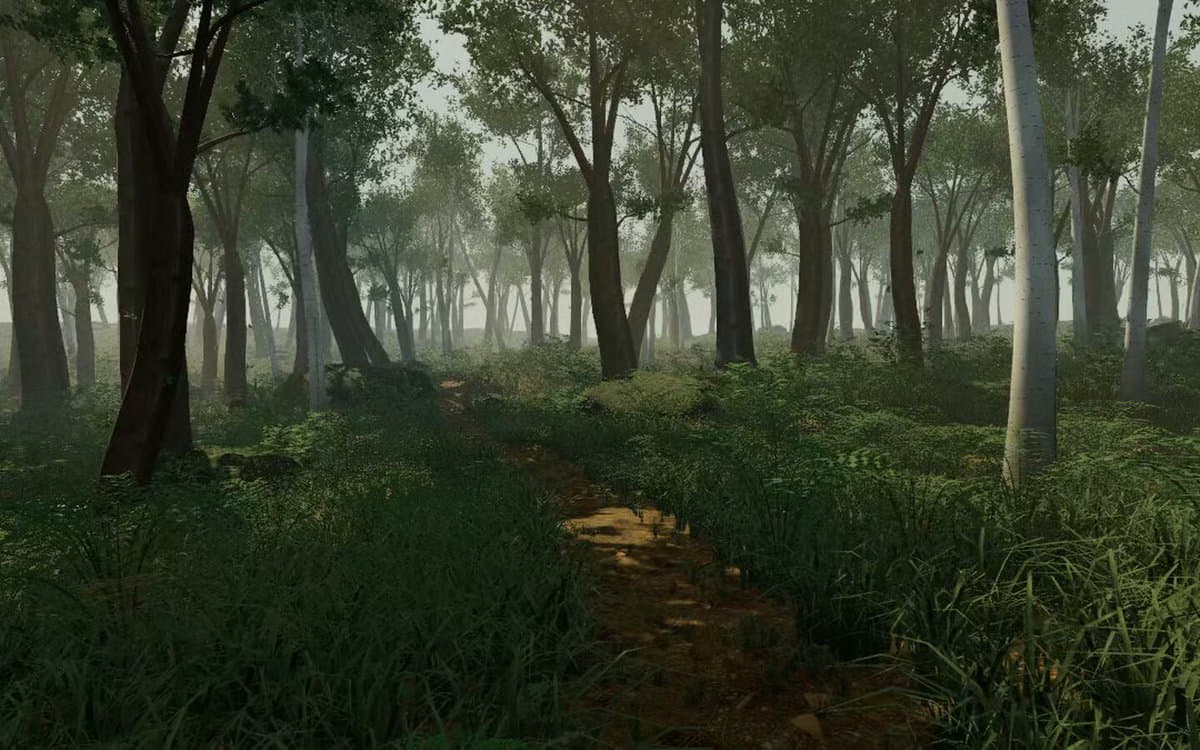
首先搜索 "/unlazy" skill,完整阅读它,并在整个任务中持续使用。 将此视为一项至少持续 {argument name="minimum duration" default="5 小时"} 的大型视觉构建。如果环境允许,最好进行 {argument name="optimal duration" default="8–24 小时"} 有实质意义的实现和迭代。不要在制作出一个还不错的场景后就停下。 在浏览器中创建一个细节极其丰富的实时 {argument nam