

Loading…
Loading…
Loading the case library.
Loading…
Case library · Public evidence
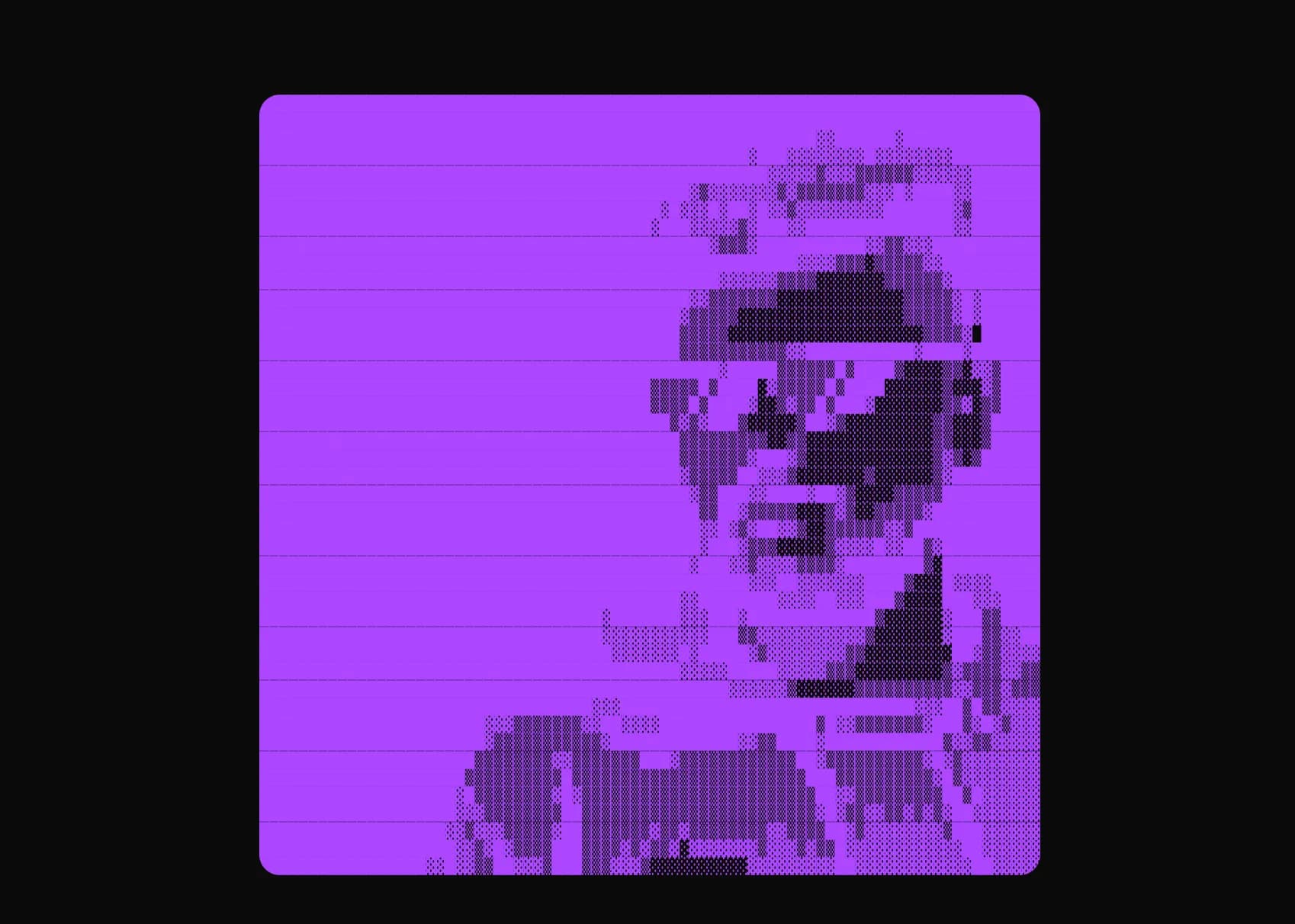
Copy this TSX component source into an AI coding tool such as Cursor, v0, or Claude, and tell it this is the Aceternity UI ASCII Art component. It can then wire it into your React project, and you can swap the copy, colors, and trigger parameters to reuse it.
Prompt
// components/ui/ascii-art.tsx "use client"; import React, { useEffect, useLayoutEffect, useRef, useState, useCallback, useId, } from "react"; import { motion, useInView } from…

Recreation of a Duolingo-style style guide page, using Nunito and Feather Bold as two typefaces, with hosting URLs given even for the unofficial font.
Prompt
Fonts Primary font: 'Nunito' from Google Fonts (weights: 400, 500, 600, 700, 800, 900) Display/heading font: 'Feather Bold' from…

Copy this TSX component source into an AI coding tool such as Cursor, v0, or Claude, and tell it this is the Aceternity UI 3D Globe component. It can then wire it into your React project, and you can swap the copy, colors, and trigger parameters to reuse it.
Prompt
// components/ui/3d-globe.tsx "use client"; import React, { useRef, useMemo, useState, useCallback, Suspense } from "react"; import { Canvas, useFrame, useThree } from…
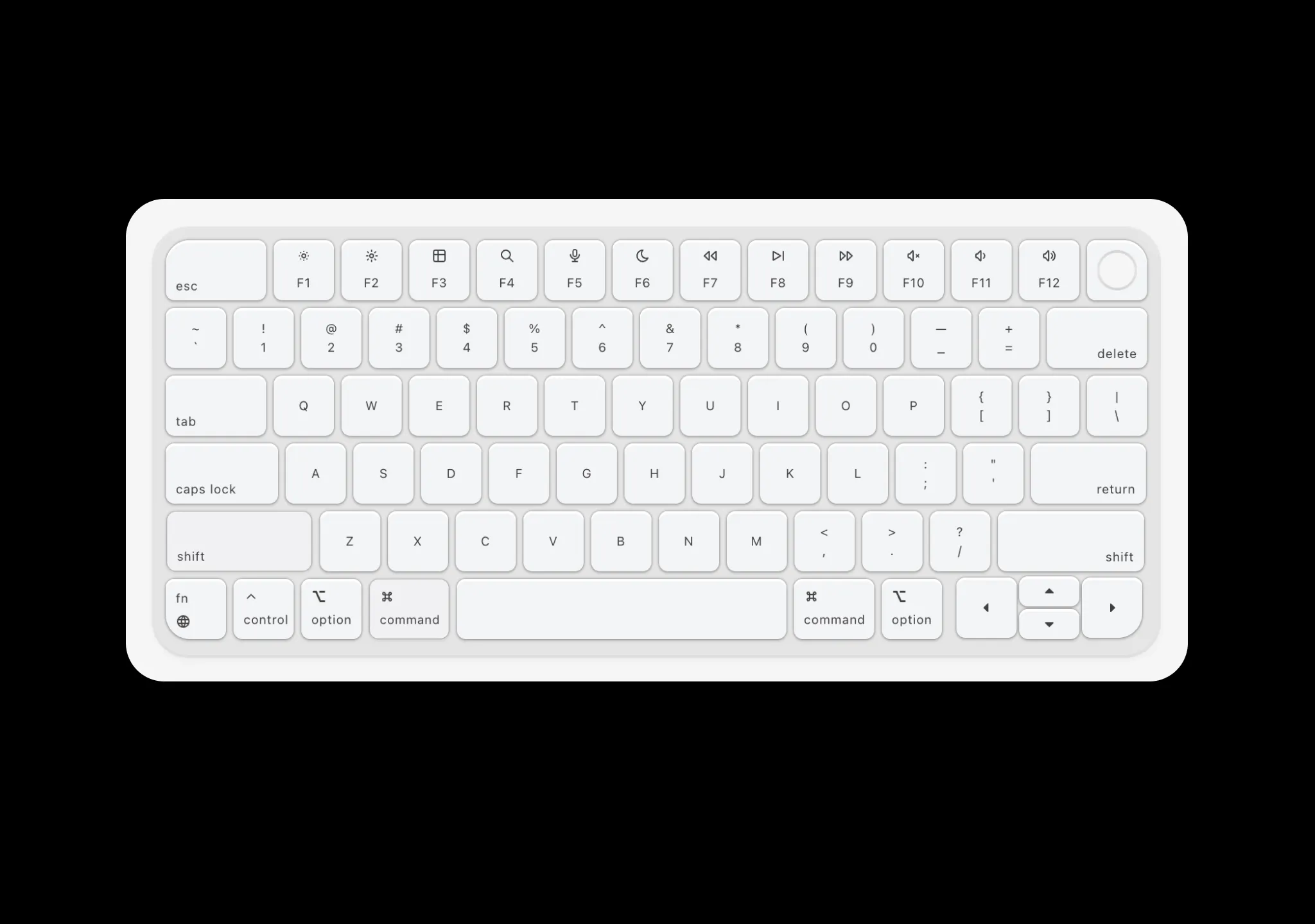
Copy this TSX component source into an AI coding tool such as Cursor, v0, or Claude, and tell it this is the Aceternity UI Keyboard component. It can then wire it into your React project, and you can swap the copy, colors, and trigger parameters to reuse it.
Prompt
// components/ui/keyboard.tsx "use client"; import React, { createContext, useContext, useEffect, useRef, useState, useCallback, } from "react"; import { motion, AnimatePresence } from…
Landing page for the design agency Axion Studio, using a shaders package for a shader effect in the hero background. The only WebGL shader entry in this batch.
Prompt
Build a React + Vite + Tailwind CSS landing page for "Axion Studio" - a design agency site. Use the `shaders` package (npm: `shaders`) for the hero background, `lucide-react` for icons.…
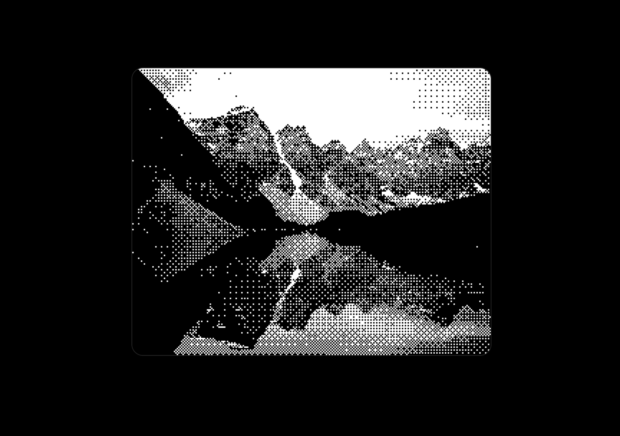
Copy this TSX component source into an AI coding tool such as Cursor, v0, or Claude, and tell it this is the Aceternity UI Dither Shader component. It can then wire it into your React project, and you can swap the copy, colors, and trigger parameters to reuse it.
Prompt
// components/ui/dither-shader.tsx "use client"; import React, { useEffect, useRef, useCallback, useState } from "react"; import { cn } from "@/lib/utils"; type DitheringMode = "bayer" |…
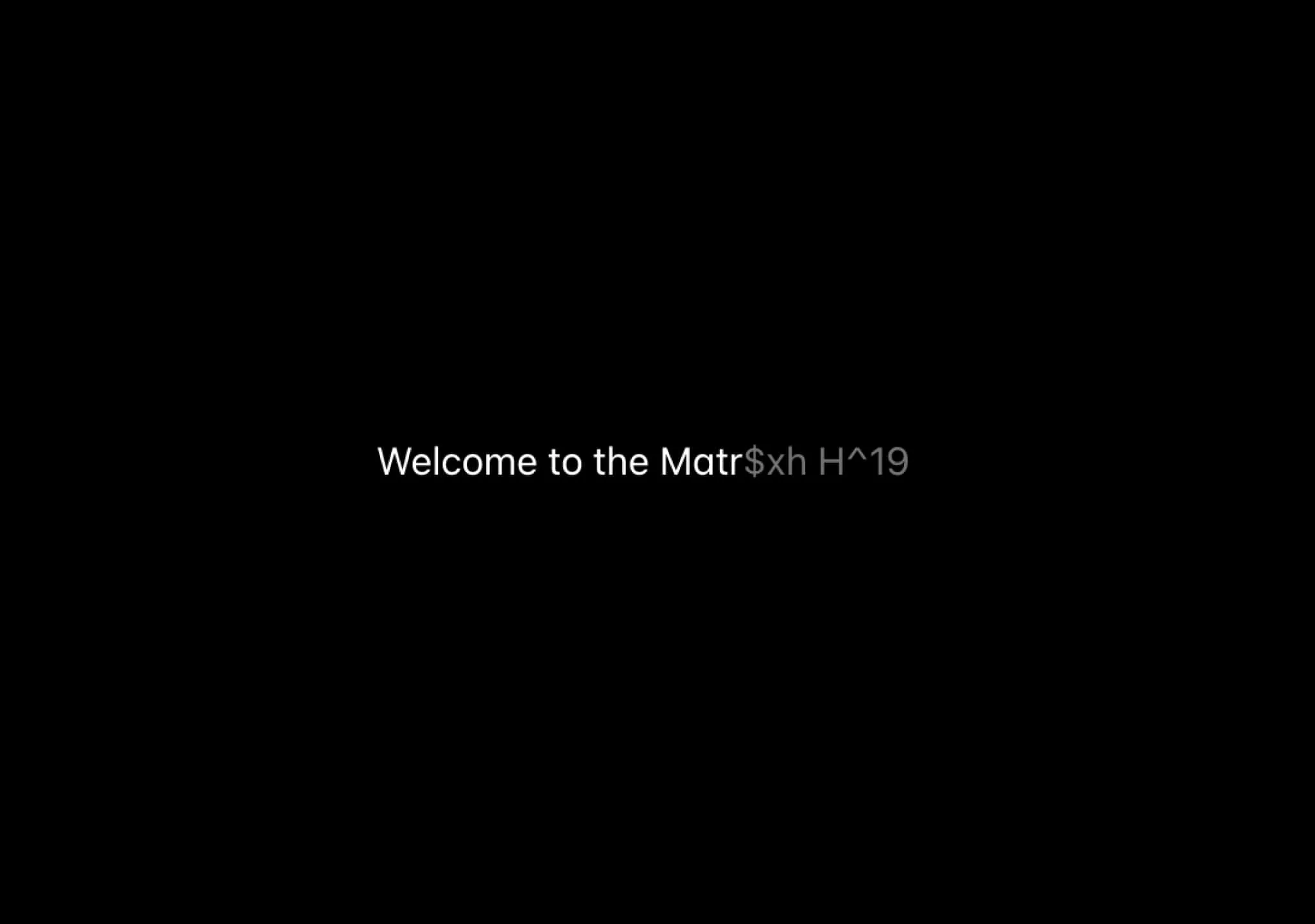
Copy this TSX component source into an AI coding tool such as Cursor, v0, or Claude, and tell it this is the Aceternity UI Encrypted Text component. It can then wire it into your React project, and you can swap the copy, colors, and trigger parameters to reuse it.
Prompt
// components/ui/encrypted-text.tsx "use client"; import React, { useEffect, useRef, useState } from "react"; import { motion, useInView } from "motion/react"; import { cn } from…

About Me section for a personal site, built with React and framer-motion, loading all weights of the Kanit font on a #0C0C0C dark background.
Prompt
**Prompt:** Create an "About Me" section using React, Tailwind CSS, and **framer-motion**. The site uses **Google Font "Kanit"** (weights 300-900) and a dark background `#0C0C0C`.…
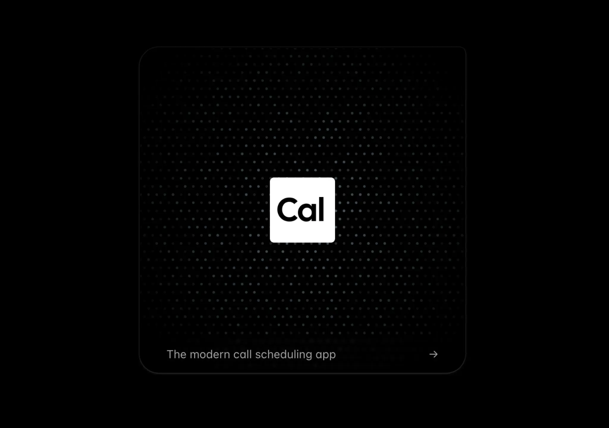
Copy this TSX component source into an AI coding tool such as Cursor, v0, or Claude, and tell it this is the Aceternity UI Dotted Glow Background component. It can then wire it into your React project, and you can swap the copy, colors, and trigger parameters to reuse it.
Prompt
// components/ui/dotted-glow-background.tsx "use client"; import React, { useEffect, useRef, useState } from "react"; type DottedGlowBackgroundProps = { className?: string; /** distance…

Copy this TSX component source into an AI coding tool such as Cursor, v0, or Claude, and tell it this is the Aceternity UI Canvas Text component. It can then wire it into your React project, and you can swap the copy, colors, and trigger parameters to reuse it.
Prompt
// components/ui/canvas-text.tsx "use client"; import { cn } from "@/lib/utils"; import React, { useEffect, useRef, useState, useCallback } from "react"; interface CanvasTextProps { text:…
Dark, cinematic site with two full-screen sections (Hero and Capabilities), built with React, Vite, TypeScript and Tailwind.
Prompt
## Prompt Build a single-page React + Vite + TypeScript + Tailwind CSS site with exactly two full-screen sections (Hero and Capabilities). The page is a dark, cinematic web design agency…
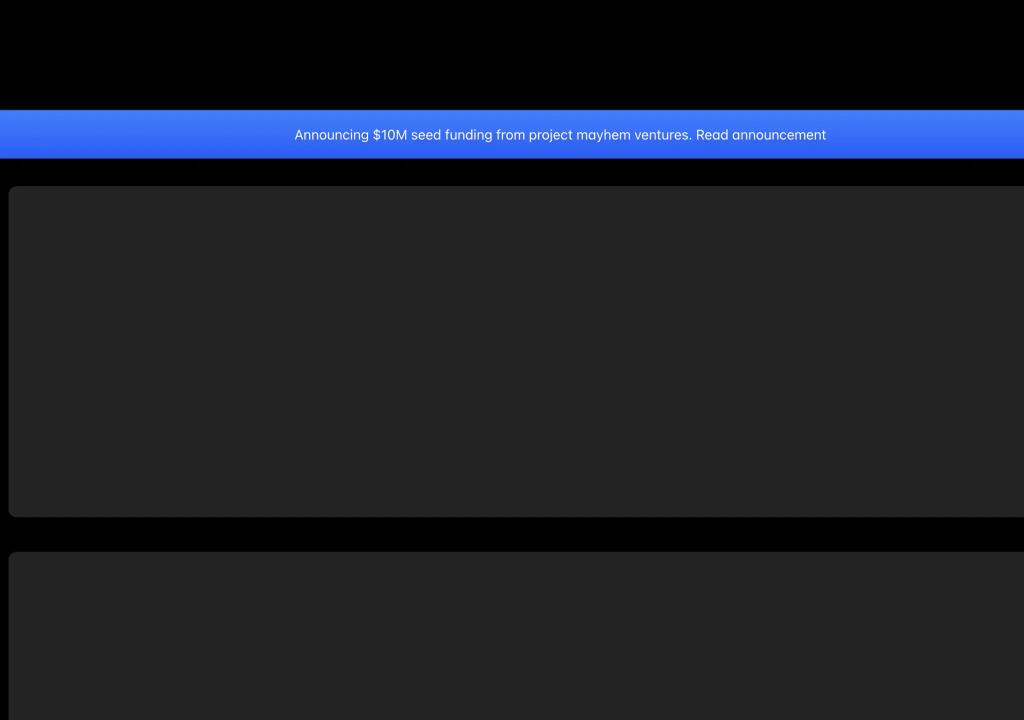
Copy this TSX component source and hand it to an AI coding tool such as Cursor, v0 or Claude, noting it is the Aceternity UI implementation of Sticky Banner. The tool can then wire it into your React project, and you swap in your own copy, colors and trigger parameters.
Prompt
// components/ui/sticky-banner.tsx "use client"; import React, { SVGProps, useState } from "react"; import { motion, useMotionValueEvent, useScroll } from "motion/react"; import { cn }…
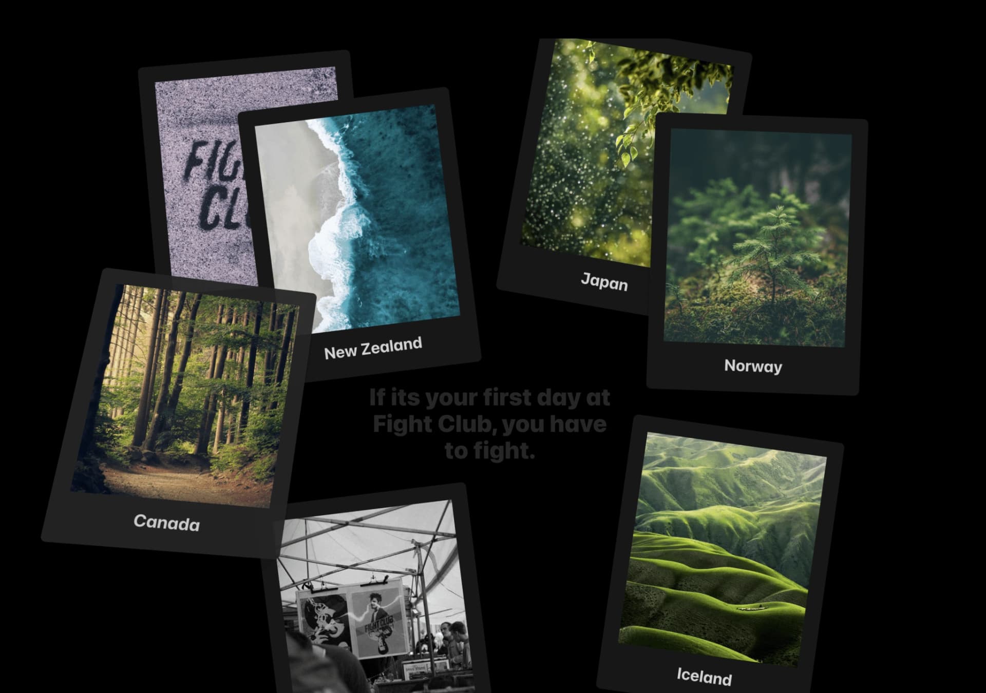
Copy this TSX component source into an AI coding tool such as Cursor, v0, or Claude, and tell it this is the Aceternity UI Draggable Card component. It can then wire it into your React project, and you can swap the copy, colors, and trigger parameters to reuse it.
Prompt
// components/ui/draggable-card.tsx "use client"; import { cn } from "@/lib/utils"; import React, { useRef, useState, useEffect } from "react"; import { motion, useMotionValue, useSpring,…
Cinematic full-screen hero for the travel brand Wanderful, built with React, TypeScript, Tailwind and GSAP.
Prompt
Build a full-viewport cinematic hero section for a travel brand called "Wanderful" using React + TypeScript + Vite + Tailwind CSS. Use GSAP for animation and `lucide-react` for icons.…
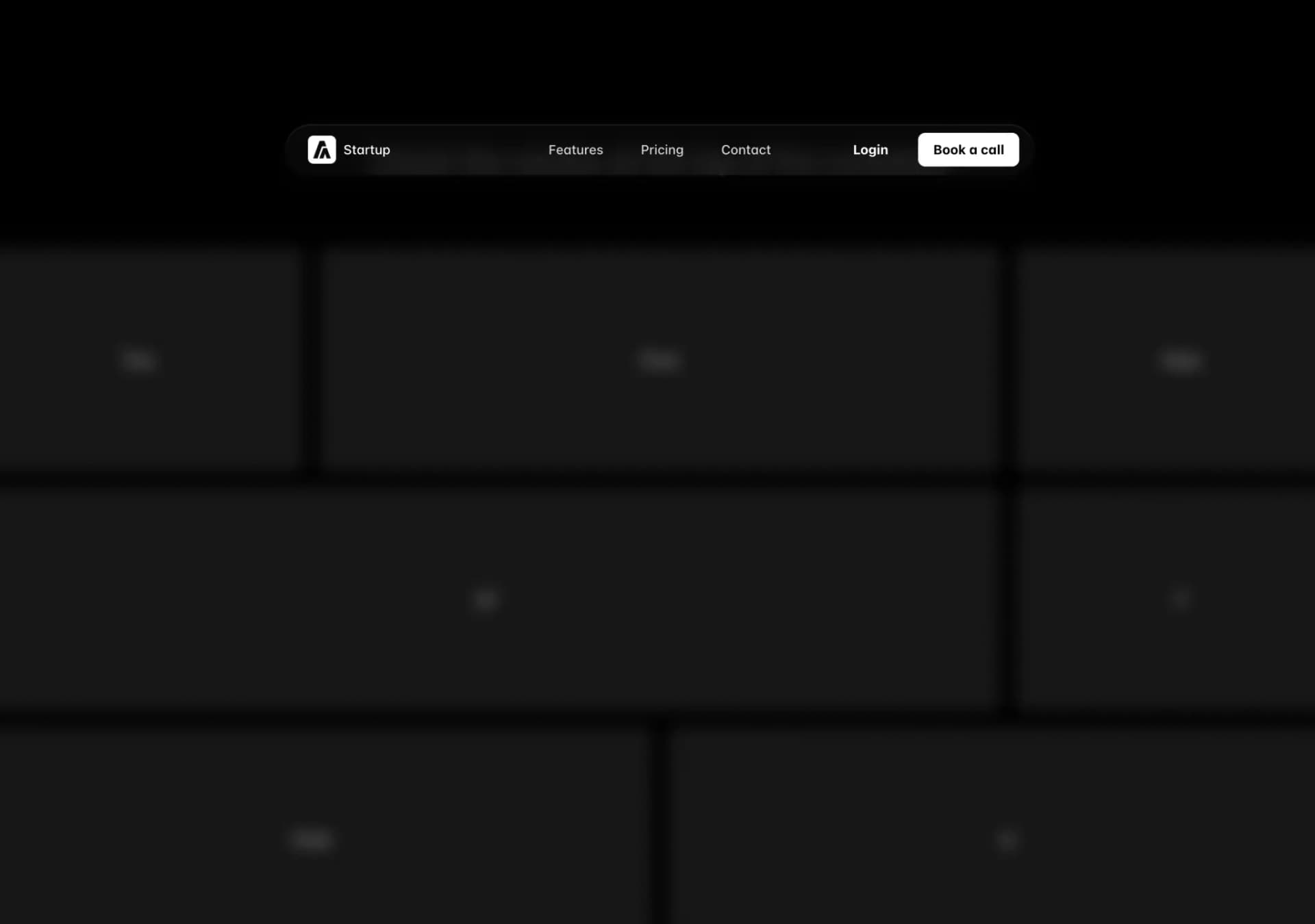
Copy this TSX component source and hand it to an AI coding tool such as Cursor, v0 or Claude, noting it is the Aceternity UI implementation of Resizable Navbar. The tool can then wire it into your React project, and you swap in your own copy, colors and trigger parameters.
Prompt
// components/ui/resizable-navbar.tsx "use client"; import { cn } from "@/lib/utils"; import { IconMenu2, IconX } from "@tabler/icons-react"; import { motion, AnimatePresence, useScroll,…

Copy this TSX component source into an AI coding tool such as Cursor, v0, or Claude, and tell it this is the Aceternity UI Container Text Flip component. It can then wire it into your React project, and you can swap the copy, colors, and trigger parameters to reuse it.
Prompt
// components/ui/container-text-flip.tsx "use client"; import React, { useState, useEffect, useId } from "react"; import { motion } from "motion/react"; import { cn } from "@/utils/cn";…
Exact recreation of the PricingSection pricing block, built with React 18 and framer-motion, in the same design system as Rocket CTA.
Prompt
Build a `PricingSection` React component that matches the spec below exactly. ## Stack & global setup - React 18 + Vite + TypeScript, TailwindCSS, `framer-motion`, `clsx` +…
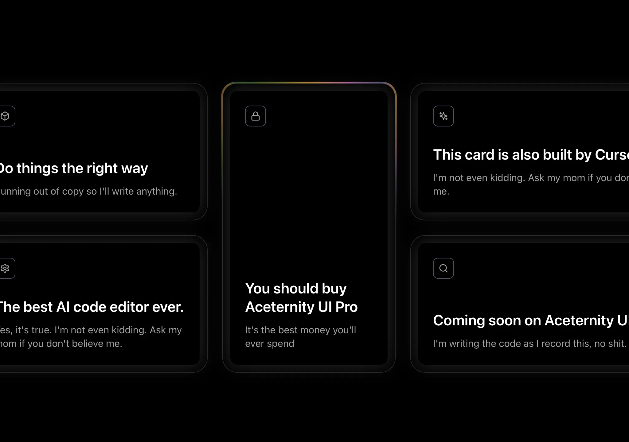
Copy this TSX component source into an AI coding tool such as Cursor, v0, or Claude, and tell it this is the Aceternity UI Glowing Effect component. It can then wire it into your React project, and you can swap the copy, colors, and trigger parameters to reuse it.
Prompt
// components/ui/glowing-effect.tsx "use client"; import { memo, useCallback, useEffect, useRef } from "react"; import { cn } from "@/lib/utils"; import { animate } from "motion/react";…

Copy this TSX component source and hand it to an AI coding tool such as Cursor, v0 or Claude, noting it is the Aceternity UI implementation of Spotlight New. The tool can then wire it into your React project, and you swap in your own copy, colors and trigger parameters.
Prompt
// components/ui/spotlight-new.tsx "use client"; import React from "react"; import { motion } from "motion/react"; type SpotlightProps = { gradientFirst?: string; gradientSecond?: string;…
Perfume product section with a looping video on the left half and a lime-green block on the right. The clashing color layout is what makes it memorable.
Prompt
Build a standalone React + TypeScript + Tailwind CSS section component. This is a fragrance product showcase split into two halves: a looping video on the LEFT and a lime-green product…
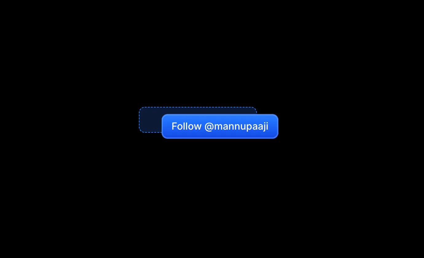
Copy this TSX component source into an AI coding tool such as Cursor, v0, or Claude, and tell it this is the Aceternity UI Magnetic Button component. It can then wire it into your React project, and you can swap the copy, colors, and trigger parameters to reuse it.
Prompt
// components/ui/magnetic-button.tsx "use client"; import React, { useRef, useState } from "react"; import { motion } from "motion/react"; export const MagneticButton = ({ children,…
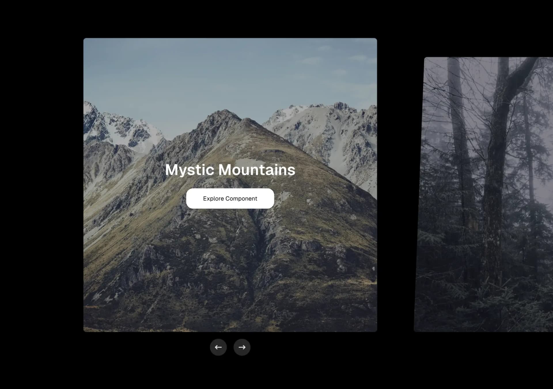
Copy this TSX component source into an AI coding tool such as Cursor, v0, or Claude, and tell it this is the Aceternity UI Carousel component. It can then wire it into your React project, and you can swap the copy, colors, and trigger parameters to reuse it.
Prompt
// components/ui/carousel.tsx "use client"; import { IconArrowNarrowRight } from "@tabler/icons-react"; import { useState, useRef, useId, useEffect } from "react"; interface SlideData {…
Product benefits section in white text on a black background, built with React, TypeScript and Tailwind with no extra dependencies.
Prompt
Build a single React + TypeScript section using Tailwind CSS. No extra libraries. Fully mobile-responsive. Black background, white text. ## Global Prerequisites - Font: `@import…
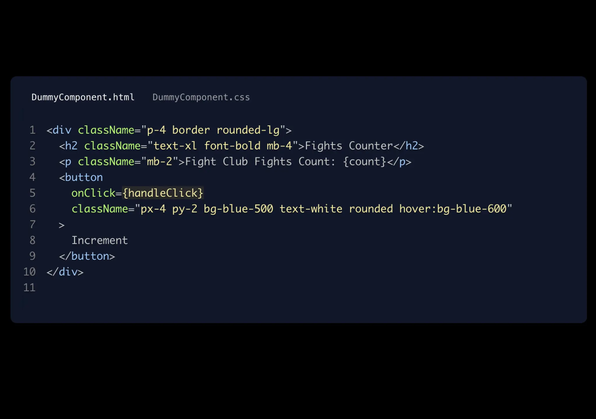
Copy this TSX component source into an AI coding tool such as Cursor, v0, or Claude, and tell it this is the Aceternity UI Code Block component. It can then wire it into your React project, and you can swap the copy, colors, and trigger parameters to reuse it.
Prompt
// components/ui/code-block.tsx "use client"; import React from "react"; import { Prism as SyntaxHighlighter } from "react-syntax-highlighter"; import { atomDark } from…